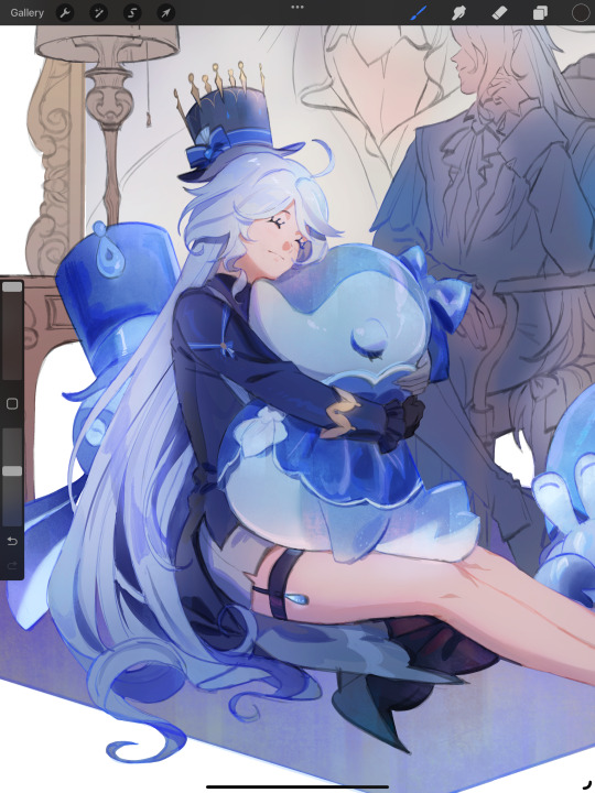
#because when I'm drawing I tend to put a lot of details in it and they always mean something!
Explore tagged Tumblr posts
Visit Tumblr Blog
Explore Tumblr blogs with no restrictions, modern design and the best experience.
Last Seen Tumblr Blogs


Fun Fact
Tumblr has 4 main sources of revenue.
Note
idk why but i always love reading your analyses of shy’s art
Aww, thanks a lot! I honestly think I sound a bit pretentious sometimes when analyzing stuff ao this really makes me happy agsihajfjd
#I just like pointing every single cool detail I see in art out#because when I'm drawing I tend to put a lot of details in it and they always mean something!#so because I want people to notice small details in my art I try to notice them in other people's art ^w^#idk if this makes sense but it's made me appreciate a lot of stuff more! seriously I've learned to love certain manga and shows a lot more#because I can look at things and go ''oh this is a parallel to that!'' ''that's connected with that other thing'“ and it just keeps going#it's pretty fun xD#pulim's answers
4 notes
·
View notes
Text
Ok! I've finally decided to put together a (somewhat) comprehensive tutorial on my latest art~
Please enjoy this little step-by-step 💁♀️
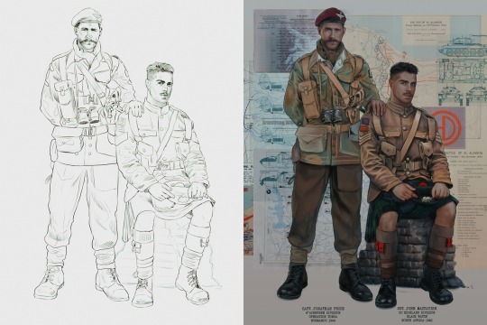
First things first--references!
Now I'm not saying you have to go overboard, but I always find that this is a crucial starting point in any art piece I intend on making. Especially if you're a detail freak like me and want to make it as realistic as possible 🙃
As such, your web browser should look like this at any given point:

Since this is a historical piece, it means hours upon hours of meaningless research just to see what color the socks are, but...again. that isn't, strictly, necessary 😅
Once I've compiled all my lovely ref pics, I usually dump them into a big-ass collage ⬇️
(I will end up not using half of these, alas :'D)
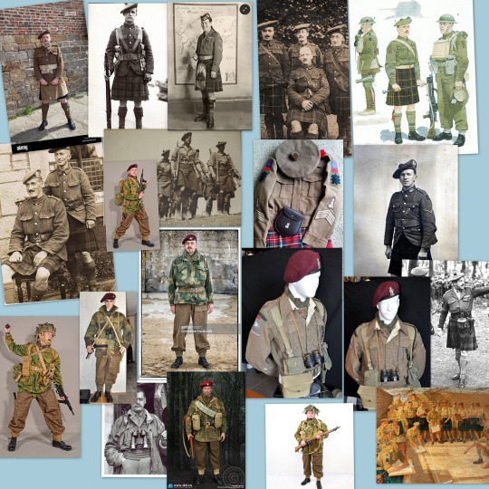
Another reference search for background material, and getting to showcase our models of choice for this occasion~
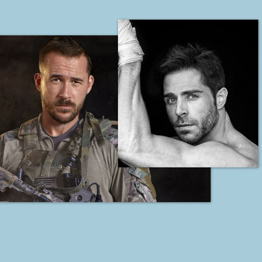
When picking a reference for an actor or model, the main thing I keep in mind (besides prettiness 🤭) is lighting and orientation. Because I already kinda know what pose I'm gonna go with for this piece, I can look for specific angles that might fit the criteria. I should mention that I am a reference hound, and my current COD actor ref folder looks like this:

Also keep in mind, if you're using a ref that you need to flip, make sure you adjust accordingly. This especially applies to clothing, as certain things like pants zippers and belt buckles can be quite specific ☝️
Now that we've spent countless hours googling, it's time to start with a rough sketch:
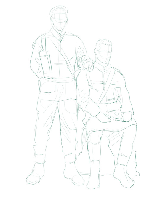
It doesn't have to be pretty, folks, just a basic guideline of where you want the figures to be.
The next step is to define it more, and I know this looks like that 'how to draw an owl' meme, but I promise--getting from the loose sketch above to below is not that difficult.
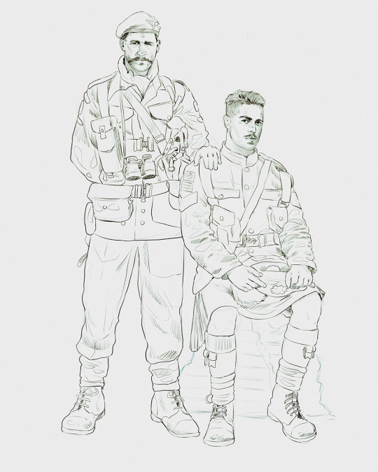
Things to keep in mind are--don't go too in-depth with the details, because things are still subject to change at this point. In terms of making a suitable anatomically-correct sketch, I would suggest lots of studying. This doesn't even have to be things like figure drawing, I genuinely look at people around me for inspiration all the time. Familiarize yourself with the human form, and things like weight, proportions, posing will seem a little more feasible.
It's also important at this stage to consider your composition. Remember to flip the canvas frequently to make sure you're not leaning to one side too often. I'm sure something can be said for the spiral fibonacci stuff, which I don't really try to do on purpose, but I think keeping things like symmetry and balance in mind is a good start ✌️
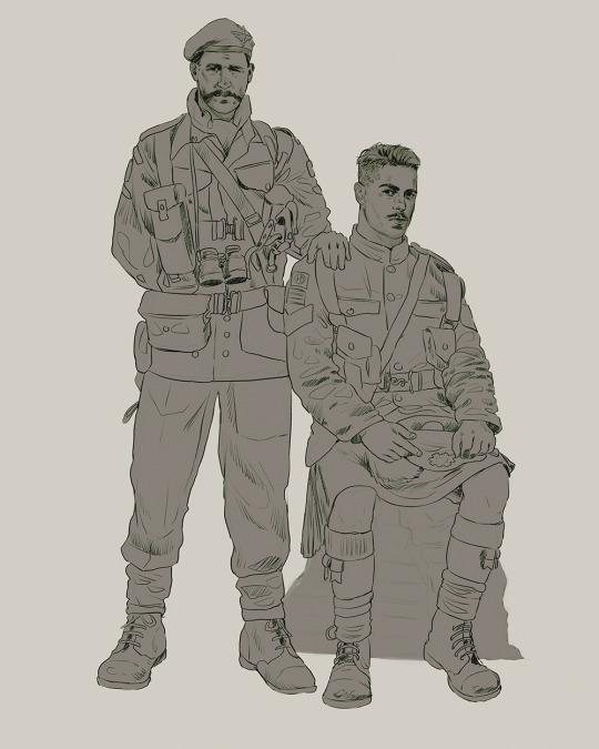
Next step is just blocking in the figures. Standard. No fuss 👍
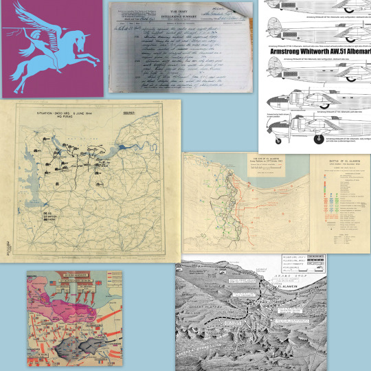
Now onto the background!
It's frankly hilarious how many people thought I was *hand-drawing* these maps and stuff 😂😂 I cannot even begin to comprehend how insanely difficult that would be. So yeah, we're just taking the lazy copy and paste way out 🤙
I almost always prepare my backgrounds first, and this is mostly to get a general color scheme off the bat. For collage work, it's really just a matter of trial and error, sticking this here, slapping this there, etc. I like to futz around with different overlay options until I've found a nice arrangement. Advice for this is just--go nuts 🤷♀️
Next, I add a few color adjustments. I tend to make at least 2 colors pop in an art piece, and low and behold, they usually tend to be red and blue ❤️💙There's something about warm/cool vibes, idk man..
Now we move on to coloring the figures. This is just a basic block and fill, not really defining any of the details yet.
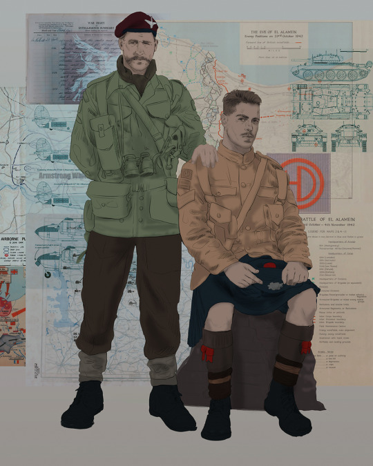
Next, we add some cursory values. Sloppy airbrush works fine, it'll look better soon I promise 🙏
And now--rendering!
I know a lot of beginner artists are intimidated by rendering, and I can totally understand why. It's just one of those things you have to commit to 💪
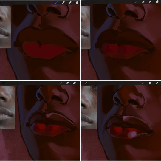
I've decided to show a brief process of rendering our dear Johnny's face here:
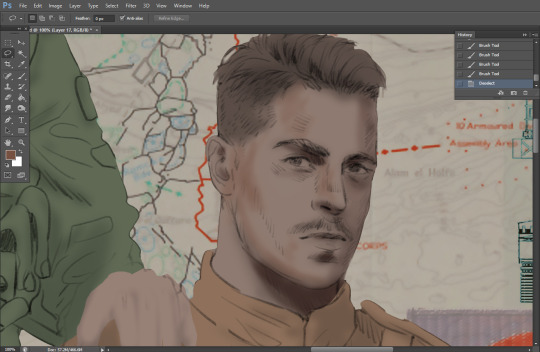
Starting off, I usually rely on the trusty airbrush just to get some color values going. Note--I've kept my sketch layer on top, but feel free to turn it on and off as you work, so as to not be too bound to the sketch. For now, it's just a guideline.
This next stage may look like a huge jump, but it's really just adding more to the foundation. I try to think of it like putting on make-up in a way~ Adding contours, accentuating highlights. This is also where I start adding in more saturation, especially around areas such as ears, nose and lips. Still a bit fuzzy at this point, but that's why we keep adding to it 💪
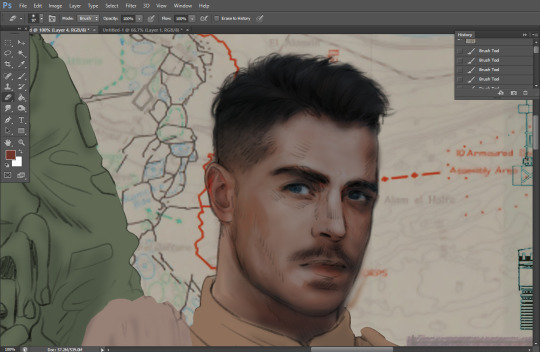
A boy has appeared! See--now I've removed most of the line layer, and it holds up on its own. I'll admit that in order to achieve this realistic style, you'll need lots and lots of practice and skill, which shouldn't be discouraging! Just motivate yourself with the prospect of getting to look at pretty men for countless hours 🙆♀️
I'll probably do a more in-depth explanation about rendering at some point, but let's keep this rolling~
Moving forward is just a process of adding to the figures bit by bit. I do lean towards filling in each section from top to bottom, but you can feel free to pop around to certain parts that appeal to you more. I almost always do the faces first though, because if they end up sucking, I feel less guilty about scrapping it 😂 But no--I think he's pretty enough to proceed 😚
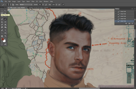
They're coming together now 🙆♀️ Another helpful tip--make sure you reuse color. By that, I mean--try to incorporate various colors throughout your piece, using the eyedropper tool to keep a consistent palette. I try to put in bits of red and blue where I can
Here they are fully rendered! Notice I've made a few subtle changes from the sketch, like adjusting the belt buckles because I made a mistake 😬 Hence why you shouldn't put too much stock in your initial sketch~
The next step is more of a stylistic choice, but I usually go over everything with an outline, typically in a bright color like green. Occasionally, I can just use my initial line layer, but for this, I've made a brand new, cleaner line 👍
And the final step is adjusting the color and adding some text:
Tada!! It's done!
All in all, this took me the better part of a week, but I have a lot of free time, so yeah ✌️
I hope you appreciated that little walkthrough~ I know people have been asking me how I do my art, but the truth is--I usually have no clue how to explain myself 😅 So have this half-assed tutorial~
As a bonus, here is a cute (cursed) image of Johnny without his mustache:
A baby, a literal infant child !!! who put this wee bairn on the front lines ??! 😭
Anyway! peace out ✌️
#tutorial#my art#art tutorial#since people have been asking#I remembered to save my process from this latest work~#enjoy 🙆♀️
1K notes
·
View notes
Text
eaudera's detailed tutorial for skin rendering
okay loves i've put together a tutorial in text form detailing my step by step process of shading darker skin + the brushes and techniques I use and why I use them. you will be following along as we shade a piece together, you can find the lineart to the piece here. *turn off your true tone and night shift displays for the most objective viewing.
i wrote a lot on the preview pictures, if you find spelling errors (which you def will) or are unable to read my handwriting, you'll find the typed out version of the writing in the alt text feature.
disclaimer: i'm not an art professor nor am i academically/classically trained in art. a lot of the verbiage and techniques i'm using to teach you all here are from my current self taught and observed understanding of art, light, and anatomy
support me: kofi / ig / twt / commissions
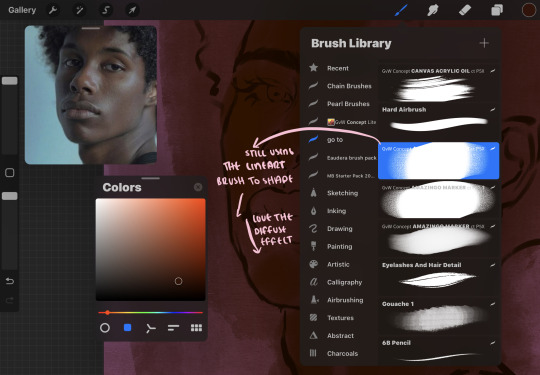
firstly, here are my two staple brushes. you can find the second brush here, i modified it by making it larger.
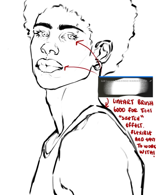
the lineart brush is very good for easy sketching and simultaneously cleaning up that sketch to produce the final lineart you'll be using in your piece. the diffusion from the erased parts/the diffusion created by lowering the pressure of your pen creates a light graphite effect which i enjoy! give it a shot.
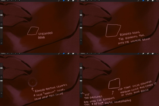
you'll notice quickly that there are lighter strokes throughout this lineart, these are simply acting as rendering guides for me in order to remember certain placements. i erase/draw over these lines a lot.
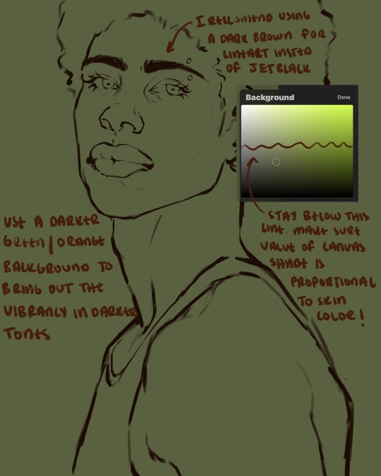
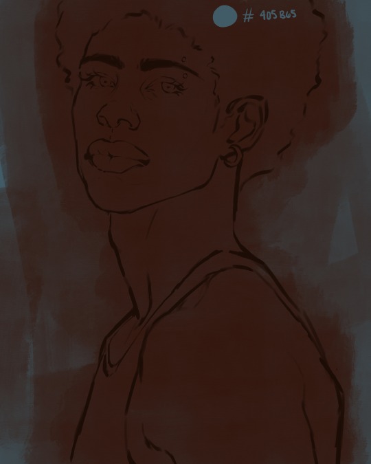
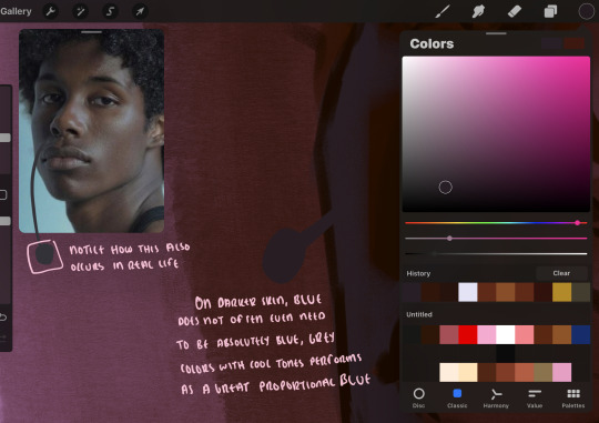
i initially learned to shade skin on a completely grey background with very slight orange undertones, and for a while this was very helpful in providing the most objective view of the base colors you're using (objective as in free of being effected by colors of different values). as you might know, using a white background for dark skin will seemingly darken the value and dim the vibrancy of your base colors, and using a black background will do the opposite. if you're using a darker skin tone, you want your canvas shade to be of a value that is proportional to your skin tone to avoid the same problems created by colors with too light or dark of a value. now if you're using a screened device to draw, you have the extra burden of screen reflections/wavering color output on different screens, so you're never really sure if the exact color you're using will be consistent across the board. priming your canvas with neutral colors will help with that. whereas priming with more vibrant colors will slightly change the undertone of your skintone (especially if you're using a low opacity brush), but it makes for a funner canvas and more creativity with your color palette imo. if you're a beginner i recommend you stay below the wavy line to avoid too light of a canvas shade.
for these same reasons i avoid keeping my lineart jet black. when you lay down the base colors under a black lineart it can look very unfavorable.
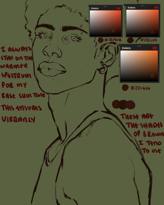
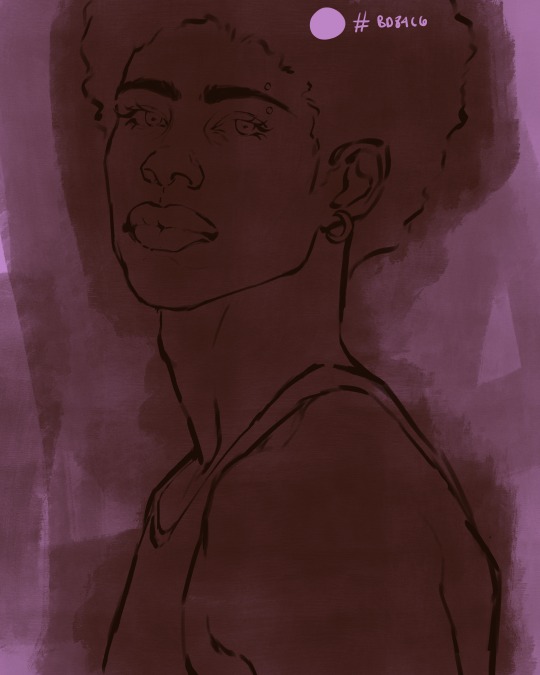
here are some skin tone variants that i tend to use the most, peep how i never wander off too far to the left of the spectrum where the reds are. i definitely favor red-oranges as compared to green-oranges for my skin tones, however, because i stay primarily on the left side of the color spectrum for my rendering, red can quickly become too much too fast. so i make sure to use a skin tone that can work very well with green-orange shadows. for this specific piece i will use the third shade (#2d1606).
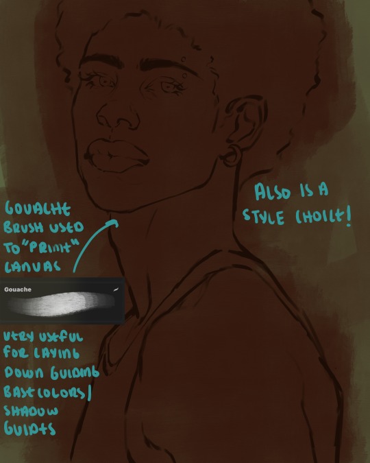
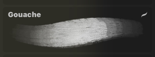
heres where the gouache brush comes in handy. i use it very loosely to "prime" the canvas almost. if you've ever done oil painting you'll realize very few artists draw directly onto a completely white canvas, though i've already primed my canvas essentially by changing the background color, i loosely shade over it with the skin tone color using the gouache brush. i find this gives me a better grasp on the composition of the piece due to increased harmony between the canvas and the skin color. it also looks really cool to me and resembles a real canvas almost.
as stated before, priming your canvas with neutral colors (grey) can help give you a more consistent view of your base colors, when you get the hang of understanding the colors you most often use (i.e, how they interact with other colors), you can start using more vibrant and fun colors to color your canvas with! the gouache brush changes opacity depending on the pressure exerted by the pen, if you zoom in you'll notice patchy areas where the canvas color bleeds through the layer more prominently than it does in other areas. for some people this might throw off the consistency of the shadows, but you should be fine as long as you're using a consistently opaque brush (which we will be doing)
i know i recommended beginners use a grey canvas like i did, but since this tutorial is using my techniques i figured i'd also teach you guys how to use variantly opaque brushes to your advantage. we will be drawing on the pink canvas from here on out.
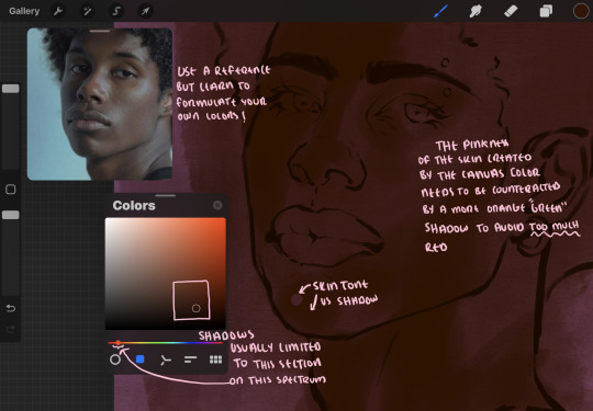
a reference is so helpful, i still rely on references to guide my shadows/lights. i'm past the point of relying on references for exact coordinates for rendering or lineart, but they are still incredibly helpful. in most references of darker skintones you come across, color dropping directly from the picture will give you very grey colors! we want to prioritize vibrancy in this case, so attempt to formulate your own colors or colordrop and increase the vibrancy :)! keep in mind i'm now using the lineart brush to shade. the diffuse/soft corners of this brush allows fewer pixels to be scattered wherever you lessen the pressure, this is perfect for color dropping medium colors to blend two colors together. you'll see how i blend colors later on.
as mentioned previously, red can become too much too fast- so i avoid monochrome rendering as much as possible by using shadows of different undertones. my most frequent combination is using a red-orange skin tone and then using a green-orange shadow.
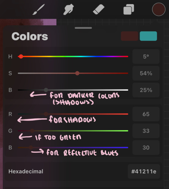
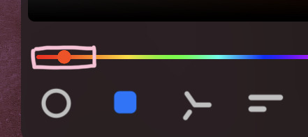
the value spectrum will be your best friend in mixing values and undertones, i use it all the time to formulate the best less saturated darker shadow that is proportional (not too dark, not too grey) to my skintone value. if the shadow is too green simply increase the magenta, if you're looking for a "reflective" shadow, increase the blue.
when i begin shading, i always slide the curser to a truer orange color on the spectrum and increase the saturation (slide towards the right) while i decrease the brightness (slide down). heres how it looks when i'm jumping between shadows and highlights while trying to keep my colors proportional (but not identical) to whats happening in the reference ^. i most often times will rely on the value tool, however.
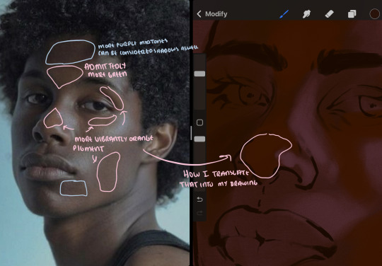
you will notice that a lot of darker skin tones have patches of orange vibrancy, these areas are most common on the nose and cheeks. this is only a detail to pay attention to if you're going for more of a realism rendering style :)
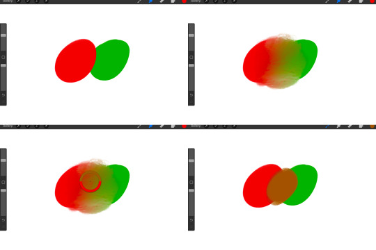
now onto how i prefer to bridge/blend colors together by utilizing the blend tool.
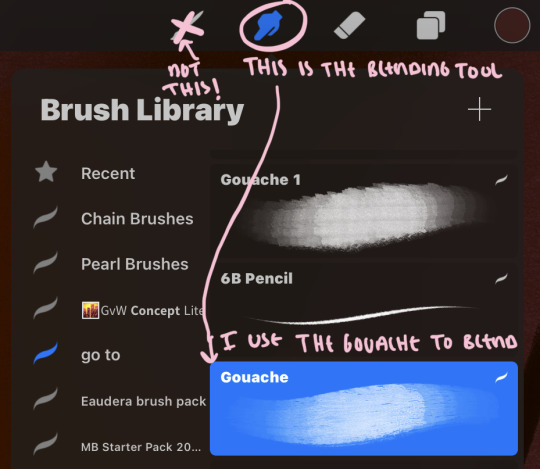
i do not like simply blurring colors in order to blend colors together, it can lead to overblending which can make your portrait look heavily gaussian blurred (think 2010 deviantart art... yea that). the brilliant thing about procreate is you can utilize brushes really efficiently, which include changing the brushes you use for blending. so in reality, artists who use the blending tool on its own can still have portraits that don't look it! there also exists plenty of brushes that have properties allowing it to blend into its surrounding colors are you draw. but in my case, the above photo is 99% of the times how i will bridge two colors together. doing this allows me to keep pretty consistent brushstrokes across the whole portrait, which i enjoy. it also gives me better control of the shapes i use in my rendering, an aspect that is pretty easy to lose when you're using the blending tool directly and solely.
in case the blending process is a bit hard too see, heres that same process recreated with different more visible colors:
now once you've placed your shadows where they generally tend to be (according to the reference photo), let's make those shapes a bit more specific and pick up on smaller details to make your rendering look more complete.
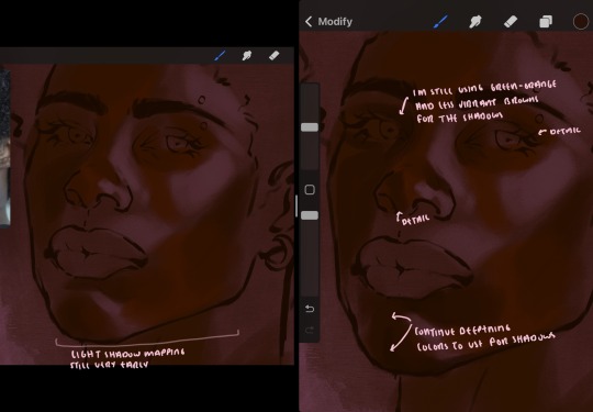
your base colors will never be as dark or as light as you need them to be when you begin rendering, making sure you have a decent contrast between your lightsource highlights and the shadows is key to capturing the essence of a light being cast on your character. it's much easier to keep building upon your shadows before rendering the highlights, i laid down the highlights only to create a guide/help me map my shadows better. do not darken the entirety of the areas affected by shadow, you'll find that shadows are rarely ever the same value, it's a gradual process affected by things like position, height, etc. so make sure the darkest of your shadow colors are preserved only in areas where the shadows are the or should be the darkest.
you'll notice i labeled some areas as "detail", adding very specific shadow placements is a detail. in the reference, the model has a pretty prominent brow bone, creating a shadow over where his eyelid creases just above his lash line, paying attention to feature details like this help enhance the rendering and its realism.
now that i've mapped my shadows i'm going to move onto to rendering my highlights and the region of the face where the lightsource is most prominent.
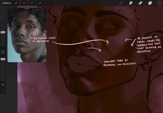
i described shadows as a gradual process earlier, this is because of the lightsource. light tends to spread when its further from the affected surface, creating a larger area affected by the light. of course, this varies depending on how intense and how close/far the light source is. in this case, the light is being casted above him further to the other side of his face, but again, remember that the face is not 2d and more prominent areas are affected more by light. it's due to this that there still exists a, albeit very minimal, shadow beneath his cheekbone. i exaggerate the shadow here for stylistic purposes, but it also helps in keeping me uphold that contrast between the highlight and shadow once again. so i refrain from blending the light into this area like i did in other areas.
midtones are the areas most unaffected by the light source, they're neither shadows nor highlights. and because light spreads, it is brighter in certain areas and darker in others. it is most easiest to blend the darker ends of the highights into the midtones of your portrait. you can emulate this by once again using your blend tool. blend the outer areas of the light and colordrop this color and use it as the darker light more proportional to the midtones. note that before i add even lighter shades to the areas where light is most concentrated, i blend what highlight placements i currently have there.
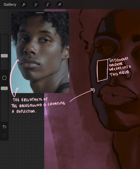
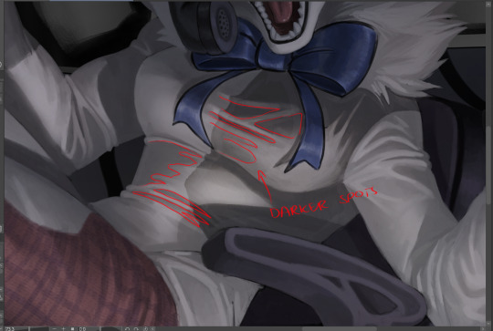
we're going to switch gears now and focus on the reflective shadow occurring on the darker half of his face.
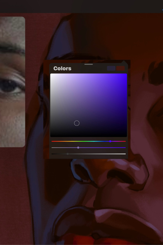
this shadow is a reflection from the lighter background the model is up against, the light being casted above him is allowing for some bounce back from his surroundings, leading to very faint light visible in areas primarily affected by shadows. hence why i'm referring to these colors as "reflective shadows".
in this case, the reflective shadows are blue, or appear to our eyes as blue. on darker skin, "true" blues (blue-purple) are not often times present. what is present rather, is a very grey tone with cool undertones/a grey tone on the blue side of the spectrum, which creates a blue that is much more proportional to the value of the skintone than a true blue. in this case i used a deeper grey on the pink color spectrum, which is more purple. this was intentional, and was done in order to create some sort of color harmony between the contrasted deep oranges im using for the bordering shadows and the blue-grey i'm attempting to emulate.
while i utilize this blue-grey, out've a purely stylistic choice, i still introduce true blues to my rendering. in fact i love using blue/purple reflective shadows in my art, it creates a stunning and colorful render. in this case, i used the blue-grey as a stepping stool to introduce that trueer blue more naturally. you'll see this happening in the second picture above, where i used a slightly more vibrant and slightly more brighter blue, and used it on areas where this reflection was more prominent (and therefore brighter).
you'll notice how the shadows that border on these reflective colors are less saturated and darker than the shadows on his chin. introduce a darker and less saturated (more green) shadow to that area on his cheek and the darkest shadow of this photo, the sunken area near his nose bridge and inner eye corner. i emphasize this line in the lineart so you can follow this shadow more accurately:
this is also a detail in my opinion and can make your portrait more realistic if you include.
we're going to pivot to his neck area before continuing. you'll find the area of his neck with the most light is also the least vibrant, i laid down a grey base color to emphasize this detail in the portrait. afterwards i added key details. i wanted to stay at least somewhat true to the color dynamics occurring in the reference hence why i used the grey, but i'm not a very big fan of using blatant grey directly on the skin, so i made it more blue.
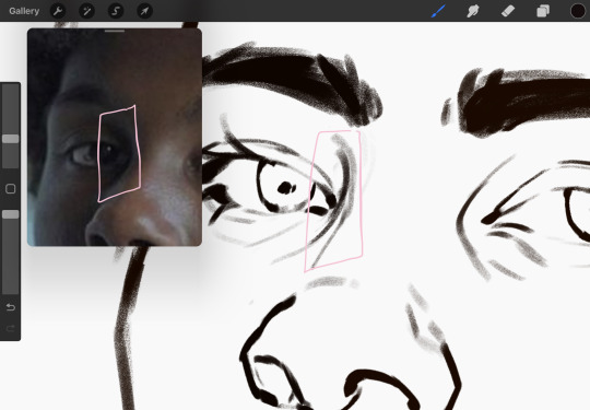
moving forward, the outer eye and the nose can be some of the most "detail focused" areas of the face when it comes to rendering. due to their more "bulbous" anatomy, light tends to curve around them in more complex ways than the flatter parameters of the face.
when it comes to the many creases that surround the eye, the skin folding over itself creates a very thin shadow from between the folds. the key to rendering this crease is to concentrate the blending to a very small scale, do not overblend the area because the hill created by the crease very easily captures light, creating an area where the shadow and highlight meet in very close proximity. slight blending is needed for this area, you can deepen the shadows in both horizontal corners of the eye for more accuracy. the midsection of the total eye area (eyeball and socket) tends to capture the most light, remember this is due to how bulbous rounder shapes tend to capture light from whichever direction its coming from.
this is of course the case for the nose as well. highlights are typically placed as a dot on the outermost part of the nose by artists, but highlights also spread on either side of the tip of the nose. the nose tends to collect a lot of oil, creating a sort of sheen on the upper parts of the nostril. when rendering a portrait where the position of the head is more cast to the side, the highlight of the nose changes from the bulb of the nose, to the upper nostril. in this case, the highlight spreads, causing a "half tone", or the remnants of the light on the bulb of the nose. this is the easiest place to blend highlights and shadows together. now for the shadow detailing on the nose, i'm actually drawing on top of the lineart on a separate layer. which i'll go into detail about in the next part. you want to focus the shadow on where your lineart is, the outermost part of the nose.
now were going to really detail your portrait by introducing a new layer, the detail layer! this isn't technically apart of the skin rendering, so i'm gonna keep it very brief. this is the layer you're going to render the lips, eyeballs, and eyebrows. more specifically, the purpose of this layer is to reduce the reliance on lineart. in terms of order, it goes above the lineart layer. we're going to soften and even erase the lineart in certain aspects. i use bolder/thicker lines when creating my lineart, but this can become a nuisance/hinderance when rendering.
starting out with the lips:
people w brown skin tend to have two toned lips, with the top lip resembling the same skin tone as the face and the bottom lip being redder/pinker and lighter than the upper lip. in my case, i prefer a more vibrant red for the bottom lip. once i lay down these base colors, i begin shading on the second layer.
i personally enjoy the look of a poutier lip shape, this includes emphasizing the middles of the lips as opposed to the ends. i've highlighted the shapes that this lip shape often entails. the small circles on the corner of the lip line are just pockets that occur when the mouth is closed and become emphasized by the fat around the mouth. the parameters of the lip lines do not often meet these round corners, theres often times a "double lip line", that exists around these areas. i love including that in the art, its very easy to emphasize by simply drawing a highlight from the corner of the lips along the curvature of the bottom lip towards the middle.
shadow mapping on the lips tend to go: highlight, shadow, highlight, shadow. the top lip going inward creates a highlight on the most outward part: the top of the lip. and the bottom lip curving outward thus creates a shadow on the bottom of the lip.
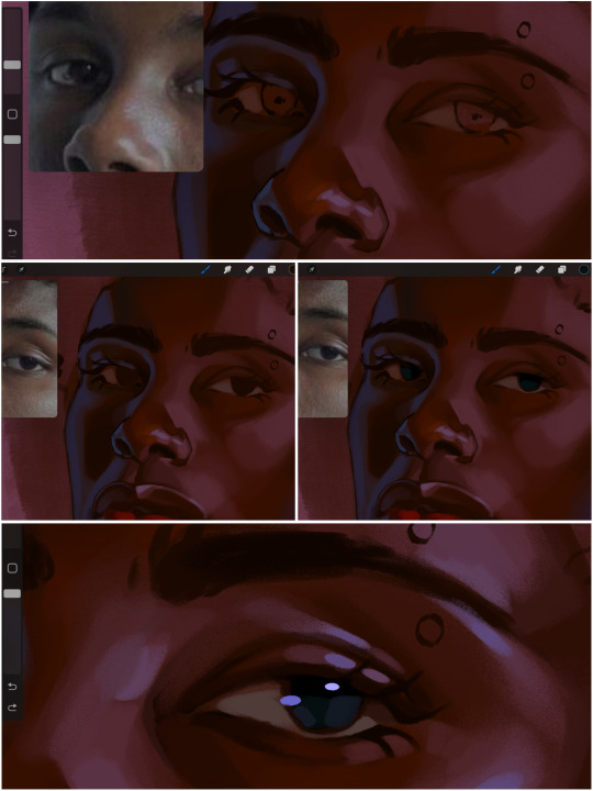
when it comes to the eyeball, i don't draw the white parts as solid white, nor do i make them too bright most of the time. they're most often times an orange grey, i also dont spread this color out if you can notice the uncolored white part of the eye. i do this intentionally to keep some of the shadows that are naturally present on the eye. very specifically right where the upper eyelid sits on the eyeball, it tends to create a small shadow that follows the curvature of the eye. this shadow is crucial, if you can see the first and second picture do not have this shadow, making the iris look more exposed and the eye appears to be held wider.
when it comes to the iris, i do very little. if i'm drawing a dark colored eye i will cover the entire iris brown, before darkening it with an almost black color. i leave the brown sides of the iris exposed to aid in bridging the values between the whiter parts of the eye and the very dark iris. this blended ring also appears on all eyes in real life. lastly, dark eyes tend to show light reflections much easier than lighter eyes. these reflections can be any color in art, in this case i kept it blue-green. i bend these reflections around where the pupil would most likely be depending on the drawing.
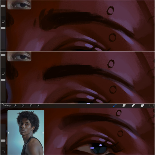
next, the eyebrow. i find it tedious to draw individual eyebrow strands when it comes to rendering, i actually prefer to blend the parameters of the eyebrows to create cohesiveness. sparse and fine eyebrow hairs are penetrated by light and shadows more than what you'd find on the scalp. it's harder to see light on someones scalp due to the bulk of hair crowding the scalp, whereas as its easier to see such light on the eyebrow. to introduce this concept to my art, i will initially draw the entire shape of the brow. then when rendering, i erase the parameters, leaving the darkest part of the brow. then i blend. the lower brow bone will be blended the least, whereas the area of the eyebrow connected to the T zone will be the most blended thanks to the shadow following the nose bridge. the far end of the brow by the hairline tends to be the lightest given the light source.
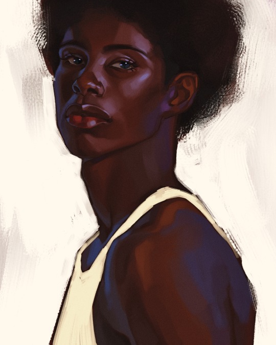
and lastly, i loosely draw a white border around the portrait for stylistic purposes. then i combine the layers (group together your layers, then duplicate and compress the duplicate group so that you still retain your individual layers) to edit. i typically add noise and play with the curve setting. and heres the finished image:
i hope you enjoyed!!
#i didnt proofread this if u find spelling errors pls lmk#black artists on tumblr#digital art#illustration#painting#black art#commissions#tutorial#art tutorial#how to shade#rendering tutorial#brushes
278 notes
·
View notes
Text
Undertale YELLOW ReImagined!

I wanted to put my own spin on how the cast of UTY would look in my style! :) I'm new to pixel art, and I had a blast trying it out! [Just to clarify, this is NOT an attempt to "fix" UTY's designs; I have immense respect for all the artists and developers working on UTY, and their work is incredible! I LOVE the cast, their animations, art and designs! This is all just for fun!] A ton more thoughts and comparison under the Read More! if you feel like reading a lot.

Flowey the Flower: I gave Flowey flushed, freckled cheeks and a tooth gap to make him look cuter and more approachable! Just a ruse, though - fluster him enough, and he might revert to that typical pale face and frown.
Clover: Clover is the iconic player character of the game so I changed as little as possible. I simply adjusted some colors and added details, including the adorable blush they have in a lot of promo art!
Dalv: I aimed to showcase Dalv's lightning powers through his design, so I gave him glowing horns and some subtle markings, including a pinkish nose. <3 While he’s originally based on Vlad, I added some minotaur elements because they really suit him. I Like in the original story, the minotaur trapped in a maze, unsure of what else is out there.
Martlet: I'll be honest, I saw some art of chubby Martlet and was inspired. To bring her passion for woodworking across, I gave her some tight but comfy overalls! She has some cool goggles that she always forgets to wear when flying - typical Martlet! Since a martlet is said to be a bird that never rests or settles, I gave her some cool glowly ghost legs! They're translucent!
Starlo: I revamped Starlo's cape by changing the patterns and adding tassels! I also removed the piece of wheat sticking to his hat because, honestly, I tend to forget to draw it. ^^* The inner fabric of his cape has a fun star pattern, tying into his previous obsession with space! And of course, big boots!
Ceroba: I made Ceroba a bit furry-like and taller, sort of to mirror Toriel! I wanted to give her a more traditional kimono with beautiful patterns, and I added eyebags to make her look a bit tired. She also has large paws now; I considered giving her sandals but ultimately decided against it.
Axis: To be honest I wanted to push his design even further but!!! Then it wouldn't be Axis anymore! :( I kept most of his original features but added some pink highlights. His antennae now have pointy tips, resembling bunny ears! I couldn’t resist the idea of a fox monster creating a bunny robot to apprehend humans - it’s just too cute! He's also taller now for intimidation factor and in case a larger human comes along.
And that's all! Thank you so much if you made it this far! More is to come soon! :) here is a wip!

I also have an AU in the works! And lots and lots of art!!!
#undertale#undertale yellow#uty#featured#artists on tumblr#my art#flowey#clover undertale yellow#uty dalv#martlet#starlo uty#ceroba#uty axis
277 notes
·
View notes
Text
I've been thinking the kind of writing I do and the kind of reactions it gets. Some authors get goofy comics of their works. Me? I just got a comment on my Captain America: Winter Soldier fic that I helped the reader understand 9/11. I am, by the way, delighted by that.
I struggle to describe my own writing style. It's wordy, I know that, and favors a LOT of detail, to its benefit and detriment. I'm indulging this tendency for my current fic because it's fanfic and I am having a lot of fun seeing what details I write that I end up elaborating on, but my number one style goal this year is to work on brevity and a snappier pace. My style is so introspective; characters spend a lot of time reflecting on themselves. I put a lot of work into making my characters complex, even at times contradictory because I think that's true to human nature. And by god, do I think about a story's themes. Do other writers think about themes this much? Sometimes I'm like, hey brain, I'm actually good on themes. Would love to get some plot.
Not to entice all the sapiosexuals out there, but I take a very cerebral approach writing. (This does not btw mean that the fic itself will be particularly intelligent.) I'm not saying this is a good or bad way--it's one way to write. My writing can feel very cold to me. Very same-y as well. That's why writing SQQ pov is so fun, it's such a radically different voice than my usual.
The fic I'm writing now was supposed to be a lighthearted fic that was an excuse for me to practice writing a sex scene. Almost 80k words in, it's so super not that. I just can't resist the thrall of complication. Although you know, as I'm writing this, I'm not exactly sure what an "intellectual approach" to writing even means to me. I use big words? I overuse semi-colons?
Maybe it's the way that I'm so language-forward in my writing. Like, what I love doing is crafting a sentence. Someone described literature to me as writing where the main draw is the author's technical accomplishment in executing their style. I definitely favor authorial voice, to the point where the stories I write that I like least feel like balsa wood gilded over. It looks nice, but you quickly realize it's weak as hell.
There's works that clearly value style over plotting, and vice versa. You need both when you write--all plot with no style reads like a synopsis of itself and all style with no plot is imagery in pursuit of nothing. Both very boring in their own way. It's interesting how totally which one weighs more affects every part of the story. Mrs. Dalloway is not a fast-paced page turner, and a thriller doesn't halt itself so we can read really beautiful, pointless paragraphs about how the color of the sky evokes memories of a long ago time when you were so different.
Maybe what I mean is that my stories tend to evolve out of the ideas that I'm exploring. In the fic I'm writing now, I had this core conceit of misunderstanding: people failing to interpret something without knowing they're doing so. In a way, the entire story is about the hard work of moving from misunderstanding to understanding. Getting information, interpreting it, having that interpretation challenged, exploring what that challenge provokes, moving either closer or further from "the truth". Shen Qingqiu misunderstands basically everything, and basically everyone misunderstands Shen Qingqiu. What situations can I make that center on misunderstandings? I also think a lot about the concept of fault--how have people failed in the past, how are they failing in the present, and how do you make up from what you have done wrong? Do you get to just move forward? Are you always at mercy of whatever you did in the past?
So a lot of the plot of the story stems out of ways that I can bring those ideas to the forefront. When I get stuck, I think of different ways these concepts can manifest. Ming Fan's getting a whole plotline because of this. I like my writing, I do, but I’ve really been thinking about the way I write affects what I write. And then in turn the reactions I get to my writing. And then I wrote this whole post because ao3 was down and I couldn’t post my chapter. And now here we are.
Also general DVD commentary on OOC fic--I hit such a roadblock because we're very close to the point of the story where Big Things are going to happen, and I could not decide on exactly how those things should occur. I had about three ideas that I was excited about. None of them were compatible with the others and each would have very different emotional implications. It's hard to write when you're essentially juggling three different drafts. The only way I got myself to commit to one was promising myself that I could always write AUs of my own fic. I honestly doubt I'll get around to doing that, but who knows. Maybe someday there will be a fic of (spoiler warnings ig for things that aren't going to happen) this fic's version of sqq and lbh in the endless abyss together.
Also you would not imagine the amount of thought I've given which conversation should happen before the abyss and where each character relationship needs to be. I have dithered like crazy. And there's so many relationships I'm working with. I'm keeping track of Shen Qingqiu's relationship with: Luo Binghe, Liu Qingge, Yue Qingyuan, Mu Qingfang, Ming Fan, Shen Jiu, Qing Jing Peak as a whole, a couple of OCs, the System, and his concept of self. Mu Qingfang has not been on screen for a minute but it's not because he doesn't haunt my plot outline. Sorry, bud, everyone else just keeps getting more pressing stuff.
81 notes
·
View notes
Note
Body type hc?? POST EM

Hehe, thank you for asking! I imagine they will change with time as I draw them more, but I noticed I was pretty inconsistent with my sketches and wanted to workshop the details out and get a starting baseline.
More thoughts under the cut! I talk a lot, sorry. I have too many thoughts in my brain about Madcom and not enough people to yap at
For context, Zero is my Madness Combat OC.
So first was establishing the big height difference between Hank+Zero and Doc, that was pretty easy. Zero was originally meant to be the same height as Hank, but I ended up making him a smidge taller. Hank strikes me as the big towering beast, and I wanted to retain that distinction because Zero isn't AS feral and menacing. They're around the same height if he's hunched forward, though.
I intentionally made it so that both of them could put their heads on top of Doc's and envelop him when hugging.
Additionally, I gave them all different 'body silhouettes' to differentiate them further. Doc is round, somewhat pearish. Hank is an inverted triangle. And Zero is rectangular and hourglassish.
I originally drew Doc's head as kind of squareish (and still do sometimes), but I wanted it to be distinct vs Hank, so it ended up more rectangular oval...y. Definitely a real shape.
When it comes to scars, I kind of just place them where they look best, but I tend to keep a few consistent. For Zero, it's on the torso, neck and tail. For Hank it's the head scars, the torso stitching and generally having much larger scars.
Doc has the least amount of scars, has a bit of body hair and has his top surgery scars. Trans win! I'm not entirely satisfied with his face scars, but I imagine I'll get better at it with time. I need more practice drawing his mohawk, but I tend to draw him shaved most of the time.
I'm really attached to this hunched, scowling demeanour he has, especially when it's emphasised by his fur collar.
Hank is hairless, has more scars than Zero and a lot more from being stitched back together. I also gave him big talon claws that I can retract, cus I think it's cool. Murder beast ripping into people <3
I think I kind of snatched his waist a bit too much, but I wanted to strike a balance between lanky and well-built. It'd mostly be covered by his coat anyway, so it doesn't bother me too much besides amusing me a bit. I also think his legs would be longer than Zero's. I WILL put that man in combat heels
Zero is hefty, sturdy and hairy, which Hank likes a lot (I imagine the sensory difference would be nice). I draw her with both a masc and fem-presenting chest depending on how I feel, and if masc-presenting it's also with top surgery scars. I imagine she just changes her body with her Magiturge powers when she feels like it.
It just felt it was fitting to me. She's fighting all the time like Hank does, but I wanted her to be sturdier and I'm pretty happy with how she came out.
Her claws are non-retractable, and they're a bit duller than Hank's. Think like how non-retractable claws in animals end up duller from walking, but retractable claws in predators stay sharp.
I'm a complete amateur but I'm really passionate about shape language and character design. I hope I can do better with time!
71 notes
·
View notes
Text
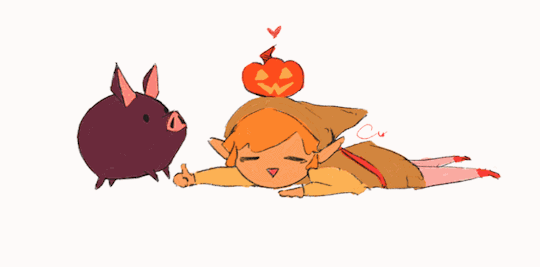
linktober 31 - HAPPY HALLOWEEN!!!
I thought for the last day I'd write a little retrospective on what this whole thing was like and what I learned. I'm too tired to draw literally anything else I'm due for a break lol
So this was my second time ever attempting a linktober/october drawing challenge, but my first time managing to complete all the days and prompts. I feel super proud of myself and accomplished for pulling it off.
There were a number of things that were surprising and that were challenging for me that I wasn't expecting this month. If anything, I think this challenge really highlighted my flaws and mental blindspots with how I approach making art.
For one thing, I came away from this not liking everything I made. I think I only like about 9 or 10 of the 30 pieces I put out there. When I don't like my art, I tend to get stuck in this mental stalemate of refusing to finish a piece until I like it, but also refusing to retrace my steps and erase/rework what I have so far for fear of losing progress or not being able to replicate the line/angle/color/etc that I liked.
It was surprisingly hard to accept when I didn't like a piece but had to move on for the sake of time and post it anyway. But once I did it a few times, it got easier. I realized prioritizing my standards over my available energy is not gonna promote progress. If I kept sinking myself into one piece and not moving on until it was optimal, I never would have finished anything-- that was the pitfall that ultimately made me bail out 10 days in last year.
I also realized my sunk cost fallacy/"what if I erase this and can never redraw it good again" stems from some real lack of confidence in my knowledge and techniques with art. I'm self-taught, and I think I tend to believe that everything I make is a dumb happy accident, even though I have mental rules when I draw, use tons of references, and have a process lol. There are a few pieces I started over 2-3 times before I got them right, and that's starting to feel liberating instead of like failing to me now, which I never expected to come out of this experience so that's cool.
Another place I had to learn to let go of control in this was with allowing for style variation. I really wanted each and every piece to be coherent and painterly, like they all came from the same book or something. But then I couldn't decide whether I wanted to do all/no lineart, all/no detailed background, all/no heavy rendering, etc. At the end I settled on just keeping the same canvas dimensions and just prioritizing filling up the space. Glad I ended up doing this, because I really would benefit from continuing to chill out and scale back how much I default to making dramatic, high-render pieces. I gotta break out of my comfort zone and make more sketchy little guys!
Sometimes my attachment to the prompts fluctuated; some prompts I thought I would love and then just wanted to get them over with. Some prompts I thought I would hate and subsequently half-ass, then I ended up redoing them and putting more effort & time into and loved the end result!
It was funny to also see how some pieces that I loved straight up did not get a whole lot of notes or attention. Some pieces I was "meh" about did crazy numbers lol. I'm used to posting maybe 5-6 times a year on here, so I'm usually indifferent to getting notes (by which I mean, I'm super grateful for likes & reblogs and the super sweet & funny messages in y'alls tags, but I'm not butthurt when I don't get notes because whatever happens, happens). Churning out 30 pieces in 30 days made me sometimes get bewildered by what did and didn't get notes, but frankly in the end I think it helps reaffirm that I should continue putting whatever I want out there because it! is! not! graded!!!
So would I do Linktober again? Probably not, sorry! it was a lot of time & effort and took me away from fall festivities more than I would have liked. I kinda only managed to pull this off because I was transitioning between jobs this month and had a week off to just draw. But I also completely see the value in taking on a challenge like this and finishing what I started, I'm super glad I did this, I think my art improved from it. I would definitely do future drawing challenges/prompt things that are quicker or have less prompts!
My advice to prospective future linktoberers: pace yourself and be gentle; this is a great chance to do something exciting and new with your art, but above all it's about you having fun. There are no prizes at the end except for what you've learned and how you feel about it, and that's for the best!!
One thing's for sure, I am zelda'd out lmao so I'll be branching out towards some little projects I have lined up for personal art and other fandoms I'm into right now
So anyway thanks to all of you who read this or who gassed me up this whole month, I appreciate you!!!!!!!! ヾ(^∇^)
73 notes
·
View notes
Text
As I'm sure many of you are already aware, Did You Know Gaming (who have been doing some really great investigative work lately) recently put out a video on canceled Sonic games. The whole thing's worth a watch, but I have to bring it up here specifically because they talk about the plans for Sonic Chronicles 2 with a LOT of new info directly from the lead designer.
youtube
The section on how the story of Sonic Chronicles 2 would have went starts at 9:45. It's very interesting! He outlines the whole plot, including the fact that they were going to end with ANOTHER obvious plot hook for a sequel in the hopes that they or some other studio could keep the Sonic Chronicles series going indefinitely. Sonic Team even claimed they were interested in using Chronicles characters like Shade in other games. It's crazy to imagine a timeline where this might have become a pillar of the franchise.
I refuse to mourn the loss of the sequel, though, because y'all saw me stream the original. It was miserable. And with the original game selling and reviewing decently well, they would have had little reason to go back to the drawing board and overhaul that game's bizarrely hateful design.
Of course, DYKG also had to talk about the reason why the game was canceled. I was dreading this because of how often people tend to get the basic facts of the Penders cases wrong or downplay the obvious Archie Knuckles inspiration in Chronicles. But no, they did their homework! And they got the details right in part because, well... they asked Penders for comment directly. And he sent them back a MASSIVE wall of text about the whole ordeal, including some fascinating details that I don't believe I've heard before!
You can go to 15:19 in the video and scrub through to read the many, MANY screencaps of their emails from Ken, but here are the most interesting and/or hilarious tidbits to me:
#1: Perjury!
As we already knew, Ken claimed that the incomplete, photocopied contract Archie presented in court was a forgery, and that he had never signed a work for hire contract.
The judge obviously knew that one side had to be lying here, and thus was more than willing to present the case to a jury to let them decide the truth... and send whoever was deemed the liar to jail for perjury. (The judge apparently looked Ken directly in the eye when he said this, which... well, make of that what you will.)
Archie's lawyers knew that they didn't have a completely airtight case and obviously did not want to go to jail. So they decided to settle instead of going to trial in front of a jury.
(I will reiterate that Archie's arguments not working out is overall a GOOD thing, because we really do not want to set a legal precedent where corporations can "lose" a contract for a creator, make up a story about what was on the contract, and then have that hold up in court. They gotta get that shit in writing. And they didn't. They fucked up!)
#2: Sega was threatening to revoke the Sonic license!
As we knew, Sega wanted nothing to do with the comic copyright lawsuit. To them, it was Archie's job as licensee to deal with their freelancers. (Y'all watch Succession? You know how Logan loves lackeys who will eat shit for him without him having to even hear about the problem? Yeah.) And, in fact, according to Ken, Sega gave Archie an ultimatum: if they wanted their license to make Sonic comics renewed, they were gonna have to deal with Ken on their own, and cover all the costs.
Yeah, uh, this kinda makes me think that Sega being pissed about the ongoing Scott Fulop copyright case in 2016 may have been a bigger factor in Archie Sonic's cancellation than I previously thought. There was a lot going on at the time that could have contributed, but, y'know.
Anyway, Archie sued Ken for "damaging their business" largely because Sega was threatening to take away the Sonic IP. But because Archie couldn't ask Sega for help and they couldn't produce an original contract, they had to settle.
There's another detail I find funny here, though. Ken WANTED Sega to get involved in the comic copyright case, thinking that Sega would strongarm Archie into paying him the millions of dollars he wanted for "using his work without permission" so that they could be done with it. I mean, sure. I guess Sega wouldn't have cared about Archie's finances, but still. I'm not so sure that would've worked out for him.
#3: Shade!
Yes, Penders still claims he legally owns Shade, and under advice from his lawyer still intends to put out an NFT of her to put his claim to the test. Yes, it's incredible that he still hasn't put out the damn NFT. It only needs to be one image, which he already drew! The market has collapsed!
Anyway, building an argument off the legal concept of estoppel, he says that if Sega continues to not do anything about his claims that he owns Shade then, in the eyes of the court, they'll be forfeiting their claims to Shade altogether. But they aren't going to do anything because they never wanted any part in the copyright battles in the first place, and to them Chronicles is a long dead asset not worth fighting over. Why bother trying to use Shade again and giving Ken a reason to take them back to court when they can just move on? It's not like this franchise is short on characters. And so Ken can say that Shade and Julie-Su are literally the same character, and if he owns Julie-Su then therefore he also owns Shade.
Our copyright system is, indeed, a nightmare. Chronicles should have been halfway to the public domain by now.
#4: Sega's oversight on the Archie comics!
Ken says that in his first year on the series Sega only requested some dialogue changes here and there through the editor. They never requested huge script changes, and also never spoke to Ken directly. After that first year, they stopped asking for dialogue changes altogether, and Ken "had a free hand to do pretty much whatever he wanted." Yeah, no surprise there.
He does, however, say that Archie's original deal with Sega stated that they weren't allowed to create ANY new Sonic characters without informing Sega. They would've needed to make a contract every single time to get Sega's approval and make it absolutely crystal clear that Sega owned the whole cast. And then Archie just... didn't do that! And didn't tell any of the freelance creatives not to come up with new characters! Had Archie followed this rule, the trajectory of the comics would have been completely different, but there also never would've been a copyright battle in the first place.
What a shitshow. Truly.
777 notes
·
View notes
Note
Do you have any personal tips on drawing and rendering wrinkles and folds for your painting? I’ve seen so much of your work and it just fascinates me every time!
Have a slug my amigo 🐌
Thank you for the slug :3 Now I'm no teacher, but this is usually my thought process when drawing "wrinkles" on a fabric
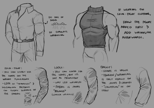
1st): I like to add one of those "bumps" on the edge of the fabric to emphasize that yes, there are wrinkles there. it pretty much helps the eyes process the idea of wrinkles being present, and it helps making it feel like figure's plausible to exist on a 3D space.
2nd): triangles, loops and zigzag-ing patterns. when I make wrinkles on fabrics, my brain automatically looks for places where "tension" would begin, and then fold everything. This means areas like joints, elbows, armpits, knees, etc. Triangles are a go-to if you want to make tighter fabrics, zigzags are more so for looser clothing depending.
When I draw tighter clothing, I also tend to draw the figure in detail first --ex. if I want to draw a tight shirt, I draw the torso in detail first-- and then adding wrinkles on where they would form after that. References definitely help a lot.

There's also the fact that I always imagine wrinkles to be two areas having a tug of war, but there's no winners
the unaffected areas of wrinkles are also ALWAYS darker (even if ever so slightly), because the wrinkles itself are more exposed to light than the rest of the fabric, except of course, on certain lighting placements. (like the light being shone directly onto the unaffected area)
(this is a commission I'm working on)
Hopefully what I've put here is comprehensible and not overwhelming, I tried my best to explain it as much as possible lol
#thanks for the ask!#Ziku's insane rambles#simple wrinkle tutorial :3#it's not 100% accurate to real life wrinkles btw it's what I would call “the bare minimum” lol#because there's SO many types of fabric wrinkling#but these methods are what I use/encounter the most when making character art#so yeah#also OC JUMPSCARE AGAIN!!!!!
92 notes
·
View notes
Text
Eddie is a big enough person that he can admit he's being difficult. He feels like a dick, okay? A nurse's job is difficult enough without a stubborn firefighter wriggling away from their relentless offers of pain medication, and he feels truly terrible about making it ten times worse.
But his team, his family, all came way too close to death today. And what did Eddie do? Lie there like a fucking damsel in distress just waiting for Buck to come rescue him.
Hell, even Hen performed a rope rescue whilst heavily concussed. Eddie was about one tenth of the muscle power behind lifting the slab of concrete off Bobby, that's it.
And, look, maybe that's not a good enough reason to snap at the very nice nurse pursing her lips into a smile for him. But Athena had dropped him down on the closest bench when they'd arrived, and everybody else was being dealt with because their injuries were more serious, and Eddie's alone. He's alone, and he has no idea what's happening to his friends, and no one will tell him anything.
The curtain hooks squeak as a dusty figure slips into his little nook in the corner of the Emergency Room, and something coiled tight in his chest loosens into warm relief when he meets their eyes.
"Hey, heard you were being difficult." Buck quirks an eyebrow at him, and Eddie can see the way his mouth twitches as it desperately tries to fight off a smile.
"I'm not being difficult," Eddie insists because maybe he's not as big of a person as he thought he was. The nurse shoots him a dirty look, and he withers under the attention. "Okay, maybe a little."
Buck huffs a laugh as he drags a spare stool over to the bedside unoccupied by the needle-wielding nurse, collapsing into it with a poorly hidden grimace. His eyes flick around Eddie's face for a moment, and Eddie swallows thickly at the attention, suddenly afraid Buck might see something on him that Eddie can barely see himself - that tends to be how they work.
(Its a lot that he's choosing not to see. Or, well, its impossible not to see, but Eddie has never cared to look too closely, never cared to take a step back and look at the whole picture.
The magnitude of it terrifies him because what he can't see he can feel. The loosened coil in his chest that had turned taut at Buck's grimace, the way the throbbing in his ribcage had eased up ever so slightly when Buck's voice had crackled through his radio, the leap of something behind his sternum when Buck's hand had found his in the chaos.
And the details of it that Eddie has spent hours staring at just for them all to blur together into an answer he's never dared read. The spot on the couch that always sits empty on Christopher's other side, the cookies Christopher's teacher had complimented him for at pick-up, the cartoon heart tucked away in the box at the bottom of the closet with all of Christopher's old drawings.
God, part of him hopes Buck reads it all right then and there, puts them both out of the misery and drags the answer out into the daylight.)
"Take the meds, Eddie," Buck murmurs gently. There's something on Buck's face, something Eddie wants to read into, something Eddie wants to find an answer in. "Please."
"Buck..."
"I saw how much pain you were in, Eds." Buck shakes his head, shoulders hunching tight with tension. He looks smaller under the fluorescent hospital lights, not the competent saviour of his team, but the little kid terrified of losing his family. "I saw it."
Eddie doesn't need to read that answer, hears it instead. Hears the: I saw the pain this time, let me fix it like I couldn't then. Hears the: I see you whether you like it or not.
"I heard it," Buck whispers. Eddie isn't sure whether or not he's meant to hear that, but then Buck is turning blazing eyes on him. "I heard it when I pulled you out, Eddie, and it killed me because I was the one making it worse."
"No, Buck." Eddie shakes his head in disbelief. "You saved me. You saved everyone."
"Please, just..." Buck drops his head with a sigh. "Let the nurse give you the meds, so she can get the hell away from you."
"Do you know anything about the others yet?" Eddie asks, too afraid of the raw quality of Buck's voice to worry about his own. Buck squints at him before his face softens.
"Hen's CT came back clear. She just pushed herself too much. Karen's already drafted up a screentime allowance for when she gets to take her home in a couple of hours." Eddie takes a deep breath, swallows down the fear that had gripped him when Hen had thrown up. Buck shuffles a little closer, the wheels of the stool squeaking with the movement. "Bobby's X-ray says his ankle's only sprained, shoulder's only dislocated. But they're keeping him overnight to keep an eye on any complications in his chest. Just in case." Another deep breath, another relief, another lingering fear. "The rebar missed everything important in Chim, but they're still in surgery patching him up, pumping him full of all the fluids he lost." Eddie exhales, a long, deep thing that makes his eyes water with gratitude. "Everyone's okay, Eddie," Buck reassures him.
Eddie turns to look at him fully then, examining Buck in a way he hadn't been able to at the bridge what with the pain, the fear, and Buck running around putting out whatever metaphorical fires combusted as they popped up. The right side of his face is caked in a paste of blood and dust that makes Eddie's stomach turn worse than the pain in his chest.
Before he can think it through, Eddie reaches up to cup Buck's jaw, swiping his thumb over the stubbled skin just under the lacerations.
"What about you?" he rasps, suddenly exhausted. Buck blinks lazily at him, blue eyes startlingly clear when they meet Eddie's, a small smile shifting the skin under his palm.
"Just some cuts and bruises," Buck tells him. "Nothing you need to worry about."
"If I promise to let you stick me with the drugs without bitching," Eddie turns to the sharp-eyed nurse, "will you let me clean and patch him up?"
"Deal." The nurse sighs heavily like its the best news she's heard all week and stabs him with the needle before he can even draw his next breath.
"Ow," he mumbles under his breath.
"Deserved it." Buck snorts.
The nurse slips through the curtain, gone just long enough for the meds to warm his veins, the pain fading into an aching hum under his skin. She returns with a box of wipes and an array of gauzes that Eddie accepts both gratefully and apologetically.
"I'm fine," Buck insists, but he makes no move to resist when Eddie tenderly cups his left cheek and reaches up to clean the right.
"Mhm." Eddie grits his teeth as inconspicuously as he can when the movement tugs uncomfortably at his ribs, unwilling to let Buck use his pain as an excuse to not be looked after. "They check you for concussion?"
"Yes, dad." Buck rolls his eyes, and Eddie tries not to think about the way Buck refers to him as dad with Christopher. Something must show on his face because Buck reaches out to touch gentle fingers to the medallion resting against his chest. Eddie's eyes sting with fresh tears. "I'll drive you home when Chim's out of surgery."
"Okay." Eddie uses the clean side of the wipe to clear Buck's face of dust. "Does Chris know about..."
"Yeah." Buck nods. "Told him we'd be a little late, but that we're both okay. He's gonna be gentle when he hugs you."
"Just as long as I get a hug, you know?" Eddie laughs wetly, dropping his head back against the wall. His eyes roll back to Buck. "Thank you."
Eddie doesn't know what magic words will erase the lingering tension in Buck's frame, but he knows without a shadow of a doubt that Christopher will because Chris always knows just how to save Buck. Has saved him over and over again.
My best friend's daughter...
Eddie grabs Buck's hand where it had dropped onto the edge of the mattress and squeezes once. Buck squeezes back twice in return. Neither of them knows what it means. Not yet.
For now, they just sit together and wait.
#sami rambles#okay i just had to write buck and eddie in the hospital bc i know buck sat with him the whole time.#911 spoilers#911 show#911 fox#evan buckley#eddie diaz#buddie#buck x eddie#911 fic#911 fanfic#911 ficlet#buddie fic#buddie fanfic#buddie ficlet#buck x eddie fic#episode coda
646 notes
·
View notes
Note
Hi, I'm sure you get this often but I really love your recent genshin artwork, do you think you could explain your painting process? I love the colouring effect in that piece especially. Thank you.
Thank you so much! I got a few messages like this from my previous piece (thank you guys for the staff pick & blaze btw, I really didn't expect all the support😭) so I thought I'd share a bit of my process below as thanks.
I always do my lineart first because it feels less daunting to me when applying colours. I will do some rough colours first so I can easily adjust it to my liking.

Next, I make sure to separate each character into different layers when I clean it up. I like to work one character or object at a time, it's less overwhelming for me that way, and I can use clipping masks for ease of rendering.

I'll usually apply some adjustment layers on top of the base layer for shadows and highlights. When I say base layer, I just mean a layer of the colour without any effects.
I like using 'hard light' for shadows, and 'screen' for highlights, but you can really use whatever clicks with you.
Rinse & repeat this process for every character in the illustration. Note that I make Furina the focus so everything behind her will be less rendered than the elements in front of them (Neuvillette is a lot less rendered compared to Furina, and the painting in the back barely has much shading).
Once I render out each asset in the illustration and add shadows & highlights to my liking, I then to merge foreground/ midground/ background elements so I can make the overall illustration clearer to read. I don't want it to feel messy or overcrowded, and I think it's easy to get tunnel-visioned in small details and lose the clarity of the entire illustration.
Make sure to zoom out constantly and make your illustration B&W to check the values to see if the drawing is clear.

I created a simple S curve with the values for readability, and have the foreground elements have darker values & contrasts.
As for the BG, I wanted to add more textures into the drawing, particularly the painting in the back. Here's an image of it when I only added in the base colours.
I use the smudge tool to create more texture once I fill in the base colours. Since I don't really 'paint' anything with the textures in, I just put in the base colours and take a textured brush to smudge it. However, over-smudging can lose the painterly texture I want, so I usually smudge vertically or horizontally in a single stroke to create a sense of movement.
Another thing to note is that I only textured the BG, I thought it would help it blend into the background a bit better. I usually wouldn't do this for the foreground because I want those elements to be clearer.
At the very end, I tend to spend a fair bit of time just fiddling with more adjustment layers, various filters (such as blur, or noise), or liquify small details to really finalize the piece. Just vibes...basically this is me

Anyway, I hope that was helpful & it made sense!! Feel free to message me if you have any other questions & I'll try my best to answer! I might've glazed over a lot since I didn't wanna make this too long.
237 notes
·
View notes
Text
Long Post about EG's Voice Designs

Unrelated Hero being adorable just so above-cut is not all text lol
Gale woke up one morning, felt nostalgic, and wanted to ramble. Therefore, Gale decided to ramble about their voice designs.
Warning: this will be a very long, just barely coherent post, where I just talk about the evolution of my voice designs. It will include a lot of old art, sketches, and side tangents. More than anything, this is for me to look back on later, if I ever need to do that or feel like doing that.
[Post-writing EG: …uh, it's like 2000+ words worth of ramble. You've been warned.]
So, I guess I'll start at the very beginning, should I?
From the very beginning, back when I was just getting into Slay the Princess, I knew that I wanted my voices to resemble The Long Quiet as much as possible, which meant that I very quickly settled on a humanoid bird-folk with a mouthless face as the base of my designs. I knew I wouldn't be able to draw actual birds, and drawing them as humans with clothes felt too far from the original game (I tend to be quite rigid with my own headcanons and stuff, absolutely nothing wrong with giving voices clothes or making them human! In fact, sometimes I get jealous over the design expression I'm missing out on. I just tend to be quite stubborn, often to my own detriment).
Fun fact, for a while, I headcanon'd that the Long Quiet has a beak but the voices do not, and I actually used to draw them like that for a while… but I realized that I'm terrible at drawing actual bird faces with beaks. So eventually I gave in and joined the mouthless TLQ crowd (only to be technically proven wrong by P&D. Oops!)


Old TLQ sketches (January 14th, 2024)
Anyways! The very first voice designs were very small changes from a base Quiet design:


Old Hero, Broken & Stubborn drawings (January 3rd - 4th, 2024). Also, silly Everest, they didn't know they would still be obsessed with StP almost a full year later—
Hero had slightly longer head feathers and ears. Stubborn was just spikier. And Broken… well, that's when I began experimenting with making bigger changes to the original Quiet design! While still very much driven by it, I gave Broken droopy ears and plucked neck/arm feathers, something that remained consistent to this day (it's lowkey my favorite part of his design)!

Here's his current design, still as droopy as always and missing neck/arm feathers.
These three were as far as I got, however, because I quickly began running out of ideas on how to keep differentiating between voices. I don't quite remember what happened exactly (I will guess that I saw other people's voice designs and got inspired), but I started to assign real-life birds to the voices and draw design features from them.

Oh hey, owl Paranoid and cockatiel Contrarian! (January 7th, 2024)
Still very much sticking to the base Quiet design, but slowly trying to incorporate more unique features to differentiate them easier. And so it began, a rabbit hole of researching bird symbolism, behaviors, and distinguishing features, all to give each voice a bird that felt right to them. Some were easier than others (like the aforementioned cockatiel Contrarian), and others were an absolute pain (Cheated was a European robin, then a white wagtail, and then finally a house sparrow), but nonetheless, these gave me a good starting point for their designs:


Early design sketches (January 22nd, 2024)
There were… quite a few mistakes made at that stage. First, and most obvious one, is the lack of shape diversity, especially in body types, as all of my voices were basically the same generic Quiet body shape, just with a few minor height changes. It made them less dynamic and much more boring to look at, especially when I put them next to each other. Second, since these designs only drew inspiration from real-life birds, they weren't super recognizable as their own voice, if that makes sense. No iconography from the game, no other details that could help identify the voice, etc. And third… I just didn’t like about half of them. I ended up giving a small redesign to Hero, Skeptic, and Cheated as a result of the Perception Check animatic (they were all present there, so I needed designs that I didn't immediately hate). But besides that, those were the main designs I used.

A frame out of my Perception Check animatic (February 27th - March 1st, 2024). Official throwback post for it coming very soon!
After that point, I didn't do much Slay the Princess art (especially not with voices), until I rejoined the fandom right around Pristine Cut release. And let me tell you, I looked at my voice designs after a long break and wanted to cry /hj
I was NOT happy with my little guys, but I still stuck with the designs I had (or close to them) for a little while longer because I just couldn't quite figure out what I wanted to do with them, especially after such a long break. I tried to figure out what to do with them as I was doing requests and random voice interaction sketches. For some, it actually worked well (Cold, for example, got about half of his redesign as a result), but others (like Cheated, Stubborn, and Hunted) did not get any attention from me.


Random assortment of voice sketches (November 14th - 16th, 2024)
My main issue at this point was trying to figure out how much detail I wanted to add to the voices and which detail I wanted to add, too. Because my voices struggled on a fundamental shape design level, I tried to compensate by adding distinguishing details (like the weird feathers on Paranoid's chest)... but that only made these designs annoying to draw. The final tipping point was this StP Monopoly post that I spent too many hours on, battling against my own designs. I got fed up with being unhappy with them. And so, it began.
I still very much wanted to use my old designs as a base because even though I wasn't happy with them, there was a certain charm to them that I would've hated to get rid of completely (I'm a very sentimental person when it comes to stuff like that). And so with that, armed with about 18 million references, including but not limited to game screenshots, real-life birds, and other people's voice designs, I began working on the silhouettes:

Actually, the first step was to figure out how tall my voices were. I used this website to help me visualize it, and I'm now realizing that they're quite tall. Except Opportunist, sorry not sorry Opportunist.

Voice silhouettes (November 24th - 26th, 2024). I will still cry over how much trouble Smitten gave me. His silhouette had about 5 different revisions, before I finally arrived at something I liked.
Why silhouettes? Well, it's a large cast of characters, and I wanted them all to be distinct, so shape language and sizes and clarity of silhouette were the most important at this stage. I already had a pretty good idea of what kind of design elements I wanted to add, so the goal was to make sure these elements had a good base, if that makes sense. Though, I couldn't resist sketching some of those details at that stage, just to see if it matched what I imagined.
I wish I had some clever reasoning for why the voices are specific size/shape/etc, but for many of them, it was based entirely on vibes and personal preferences. The only ones that had some sort of thematic reasoning for their silhouettes were Cold (I wanted him to be very tall and extremely thin, to kind of mimic a skeleton) and Cheated (the goal was to make him as sharp and spikey as possible since the Razor is his Chapter II princess). The rest? Purely aesthetics/preference/vibes. I wanted Smitten to be large and round. I wanted Paranoid to be very fluffy. I wanted Opportunist to be the shortest voice in my entire lineup (sorry not sorry Opportunist [2]). That's pretty much it lol
Anyways! Once the silhouettes were all done, it was a matter of translating all of my random notes, and ideas, and old design elements into the final lineup.

There were three key considerations when I was creating all of my voice designs, and I tried to keep them all in mind as I was drawing these:
Simplicity - I knew I would be drawing these guys over and over again, so I wanted to make sure my designs as easily recreatable as possible.
Recognizability - how easy is it to identify the voice correctly (i.e. differentiating between, say, Hunted and Paranoid or Cheated and Stubborn by looks alone)
Random nonsense - how many small details, parallels, silly references, and "this looks cool"s can I put into design while keeping 1 and 2 true.
…because nothing brings me more joy than sneaking the dumbest references and jokes into my designs. Cold's little chest feathers are a great example of that, and I will definitely talk about it one day.
Some of my favorite design elements are different little parallels these designs have to each other (especially Stranger pairs) and to their respective Chapter II princesses:
Stubborn & Broken have a bright red accent in their design, practically the only similarity in their design, indicating that they don't have much in common, except for the passion they show in their respective routes. Stubborn also got horns from the Adversary and the general rough/tattered leg feathers. Broken couldn't borrow elements from the Tower directly, but he got feathers resembling a wimple/neck piece that nuns usually wear, and his bright red chest feathers also work as a stab wound.
Skeptic & Smitten also don't have a lot in common, but they both have a shoulder shawl, working almost as a layer of separation between them and the world they inhabit, as both can be very stuck in their ways / unwilling to see past their point of view. Skeptic got a shackle similar to the Prisoner's, while Smitten's arm feathers are supposed to resemble the Damsel's frilly sleeves!
Opportunist & Hunted are both most animal-like, with Opportunist resembling a cat (for the Witch) or rat (because that's who he is), while Hunted looks like a hare. I also tried to keep their designs most organic in terms of flow, but I'm not sure I succeeded with that. Opportunist was a fun (and difficult) one to try to mirror the Witch, I ended up giving him spiky feathers resembling the Witch's tattered skirt and sticks/debris pointing out of his feathers! Hunted was much simpler and just got the same bandages the Beast has :] That is also how trans Hunted was born if you were curious.
Cheated & Contrarian are, quite simply, both falling apart to various degrees. Cheated's stitches were designed first, along with his very sharp/spiky design, to go along with the Razor. Then Contrarian followed suit, gaining his cracks to mirror both Cheated and Stranger. I've talked enough about this already lol
And then there were Cold and Paranoid. Oh, the problem children. They used to share whispy ghost-like leg feathers (which you can see in the silhouette designs), but I hated how they looked on Paranoid, so I changed it to fit with his fluffy owl aesthetic better. Works better as a whole for his design, but now these two have almost nothing in common, outside of the darker, textured/feathered sleeves (which is not enough of a distinguishing feature). But in it's own way, it makes sense for my voice designs to end up like this, as I personally have very complicated and mixed feelings on the relationship between Cold and Paranoid. But I do like the overall ghostly skeleton-like look I gave Cold to mirror the Spectre (a large X on his chest also helps to identify him), and gloves on my Paranoid to go along with Nightmare's is probably one of my favorite design elements of them all.
Oh, and of course, Hero. Hero was somehow the easiest and the hardest to design. The easiest, because I wanted him to share a lot of features with the Long Quiet (since he is our first voice and all), so a lot of the decision-making was already done for me. The hardest, because that meant I only had very limited features that I could exaggerate or add to distinguish him from my Quiet in the first place. And so I went with the "exaggerate the hell out of existing features" route, turning Hero's face/head feathers into more of a crown/visor shape… and also giving him long hair. Why did I give my Hero long hair? To be honest, this one started on a complete whim, I tried it out when I was making a silhouette for Hero, and I kind of fell in love with how it looked. It ended up working out because it kind of looks like a lion's mane, symbolizing courage, strength, and justice. But I assure you, it's not how it started lol
Did I succeed with my designs? Well, not quite - some designs are more difficult to draw than others (looking at you, Stubborn), and others lack distinctive details that identify them as that voice (looking at you, Paranoid). But I am quite happy with them as a whole. It was a great exercise in character design for me, and I love my silly birds dearly, so I'm just glad to have designs I don't hate drawing <3
Though, I am now very tempted to do an alternative version that does have them wear clothes. Just for the fun of it. Maybe I'll do it. Maybe I won't. If I do, my Contrarian is going to rock a very pretty dress.
Anyways! If you got this far into this post, thank you so much for reading it!! I just really wanted to ramble about my voices, how much they've changed, and, honestly, how proud I am of how far they've come from their original concepts. My lads are certainly not as intricately designed as some of the other folks I see around here (stares at Sonja and Polite), but I like them, I like drawing them, and that's what matters to me <3
Thanks again for reading my endless ramble, hope you have a great day!
49 notes
·
View notes
Note
(sorry if you've gotten this before or if this is not the right kind of question for the blog)
Do you have any advice on HOW to make a comic series? From what I've seen your work is fantastic, well made and written! (Cool concepts, story, and character dynamics etc)
How did you start? How DO you start?? How do you comic lol
I'm glad you enjoy my work! I'll do my best to answer this question!
I could give the ol' "Just jump in! Get started!" But I don't think that's the answer you're looking for, here. Even if it's technically the correct one.
"How do you make a comic series" Is one of those questions where the answer is kinda difficult to summarize in a single ask, because there's a whole lot that goes into it, y'know? I'll give you a brief run-down of my process.
I figure an idea for a story. In the case of Infested, the whole story was written before I even got started on the script. This is an outlier in my usual process and I don't normally do this and definitely don't recommend it.
Figure the plot like how you would figure a regular story's plot; The beats you wanna hit, the way the characters develop, the beginning, the middle, the end. What's the point of the story? What, exactly, are you trying to convey here? Who's the target audience? All that stuff ought to be figured out before even picking up a [MEDIUM OF ARTIST'S CHOICE].
Script the story. If you've seen a movie script, these things look a bit like that. You wanna not skip this step because this is where you determine the visual language of each page. Comic script writing is a whole thing and a half but I do have some random tips regarding it. -> When writing the beginning of a new scene, write down the time of day, the weather, and any important details about your setting (this is most important if you're working in a team). -> Using storyboard/film language when trying to figure out a scene is very helpful. You're not gonna remember exactly how that scene looked in your head when you finally get around to penciling it. Trust me. Write it down. Or thumbnail it! Thumbnails are also very helpful! -> Remember that you have very limited space for dialogue. Write with that in mind.
Figure the paneling on a page. I work at 11x17 and do my panel layouts based on those dimensions. I tend to make more important panels, or panels with PUNCH or SHOCK bigger than the others. Each panel is an individual illustration, but together they make a whole piece. You gotta treat it like that, y'know? Find the focal point on a page, find the most important element of it, and make that your focal point. Don't be afraid to get a lil wacky with panel shapes, either. They don't HAVE to be squares and rectangles. Check out what other cartoonists do! Get inspired! Paneling is an art-form within itself!
Page from "Hanna Is Not A Boy's Name" By Tess Stone
5. Penciling time! Get the perspective figured out, then draw the background, then draw the characters. Do it in that order. Trust me. With a background already set up, characters can be drawn more like they exist within that space, instead of floating in front of it. Also? Be aware that comic artists need to be ready to draw ANYTHING. You may have a great idea that you GOTTA put out into the world, but you have no idea how to draw, say, a car. Or debris. Or jungle foliage. There's no shame in using references, tutorials, or even doing a bit of tracing if something's outside your wheelhouse. Here's a bazillion tutorials from two guys who REALLY know their stuff.
6. Speech Balloons! Yes, really. In fact, you may want to do this and penciling at the same time. I certainly do. It's better to figure this out immediately so it doesn't hurt you later when it comes to getting your balloons to share a space with your art. Here's some great advice on the whole subject from a master of the craft
7. Inks! Line weight variation is key. Closer to the "camera" means thicker lines. If a part of a character is in shadow, that part is gonna get thicker lines, too. Personally, I make my background line art thinner than character line art. It helps the characters pop out!
8. Flats! Or flat colors if you wanna get specific about terminology. It's exactly what it sounds like -- Coloring the characters and backgrounds with the bare bones basic colors. I highly recommend keeping the character flats and bg flats on separate layers if you're working digitally.
9. Rendering! There's no hard and fast rule as to how a cartoonist ought to render their comic -- If they want to do that at all, even. Go with what you believe looks good AND is something you can do quickly. The "quickly" part is important. Heed my warning. Don't be like me.
And then I'd schedule the comic to be uploaded on whatever day suits me -- Thursday (usually) in Infested's case.
Of course, I kinda suck at relaying my process, so the final thing I can do for you is direct you to an extremely helpful book that really breaks it down in a way that may click with you as it did with me.
I hope this was in any way helpful to you!
140 notes
·
View notes
Text
Yk what no one asked for? My art process.
At least when it comes to drawing transformers... I don't put a lot of my other stuff up here haha. This guide probably won’t help with drawing TFP stuff tho. I like sticking to my cubes.
Who knows. Maybe this can help someone. Or provide amusement cause I have no idea what I'm doing. Just thought l'd share some stuff lol. And an unpopular art opinion.
So yeah, my secrets. Which like.... my art isn’t incredibly impressive or anything but... you get the point.
If you ever really wanted to try out whatever my style is called, here’s your guide. Along with a tutorial on how I draw Sunstreaker, but it’s like 5 steps lol.
I apologize in advance for the sheer amount of yapping I’m about to do. I’m just trying to makes sense
~~~~~~~~~~~
This is the part where I share my tips and tricks yippee! Small disclaimer, I just kinda do half of this stuff as a go. There is no real order to this. I’m basically just explaining how my style works (despite how much my style varies tbh)
There’s a general build for the body that I’m pretty sure most people have figured out. The head, chest, torso, and weird hip thingy. Then the legs are broken into two main segments, the arms are broken into three, shoulder, upper arm, lower arm.
Here we go, unpopular art opinion rant.
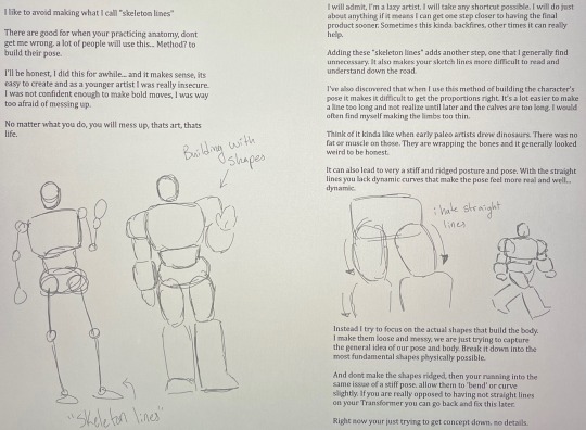
When I make my base I usually work from the head down. Don’t be afraid to use the lasso tool to readjust the sizes of different components. If the head you started with has the right angle but is too small, lasso it and make it bigger. If ur doing traditional, sorry, you’re just gonna have to redraw it.
I’ll usually try and clean up overlapping lines, but I wanted yall to see the shapes before I did that.
Then we can start adding details. I look at other artist’s designs and the source material and pick out reoccurring traits that will help make the character easily identifiable.
I tend to add the most detail to the head simply because that’s what is commonly used to identify characters. Usually when designing my version of a character I allow myself to kinda make up details for this part.
But do feel free to add your own details to make sure people can tell it’s “your” design!
These are still very simple shapes and not detailed whatsoever. We are keeping it basic on purpose.
Very loose shapes, extremely vague idea. Just putting down the most identifiable parts that are important in building it, if that makes sense. I put down the bare minimum for this.
You really don't want to over complicate things. It makes it difficult for the viewer to figure out what's going on. A crowded design is distracting and unappealing. The simpler the better.
So now we have our sketch layer done. Because I'm impatient, it's line art time baby!
I end up just kind of feeling it out with line art. There will be some changes between the sketch and the line art. I’ll also use line weight to just general shading stuff sometimes. In this one it’s not very consistent but I was kinda losing motivation cause… adhd my beloved.
This is pretty self explanatory. Use your sketch to outline what you want, adding details as you go. I'll still leave my lines pretty loose and messy for most of these, just because it adds a bit more... character? Makes it feel more authentic? But feel free to clean it up as much as your little heart desires.
Smth im really passionate about is not overcomplicating the designs and crowding it. I know I already mentioned it once but… yeah.
While adding a bunch of detail can be cool, if not executed right, it can become overwhelming and difficult to understand visually. Keep it simple, you don't need to add every crease or seam. Just the important ones that can help a character stand out or fill in an awkward large space.
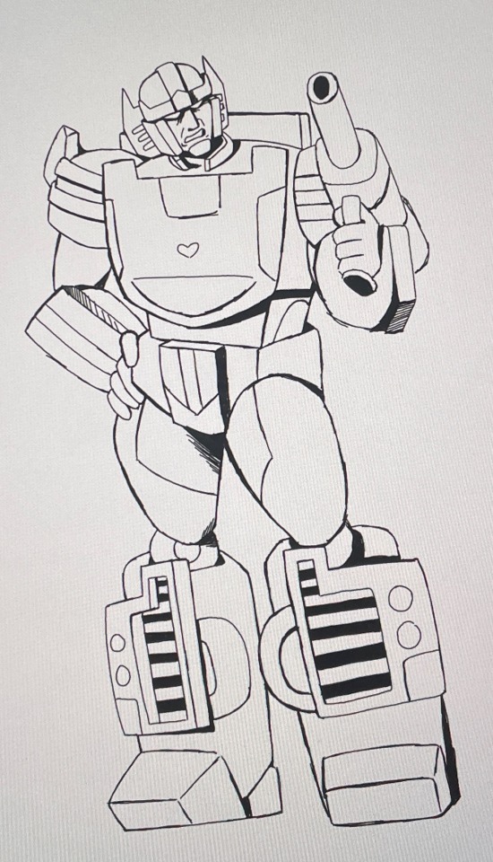
Usually after that l'll just put flat color down. Nothing fancy. I like to just do greyscale but you can go crazy. I'm not stopping you.
But adding a flat color under your line art helps pull together the sketch. It makes it easier for people to understand what is and isn't a character and makes it simpler to understand the character’s shape.
If I have several characters in one picture l'll usually make them separate colors to help make sure you can easily identify them as different people. I usually try to keep in mind the characters actual color when doing this. People with darker colors get a darker gray.
I’ll also try and give a different color to an object they are interacting with so it doesn’t get confused with the character themselves.
The entire reason I gave Sunstreaker a gun was to show this. I hate drawing guns.
These are also rarely perfect. As long as it's not extremely obvious that you're out of the lines, no one will notice. At least that’s been my experience.
I usually do this on separate layers
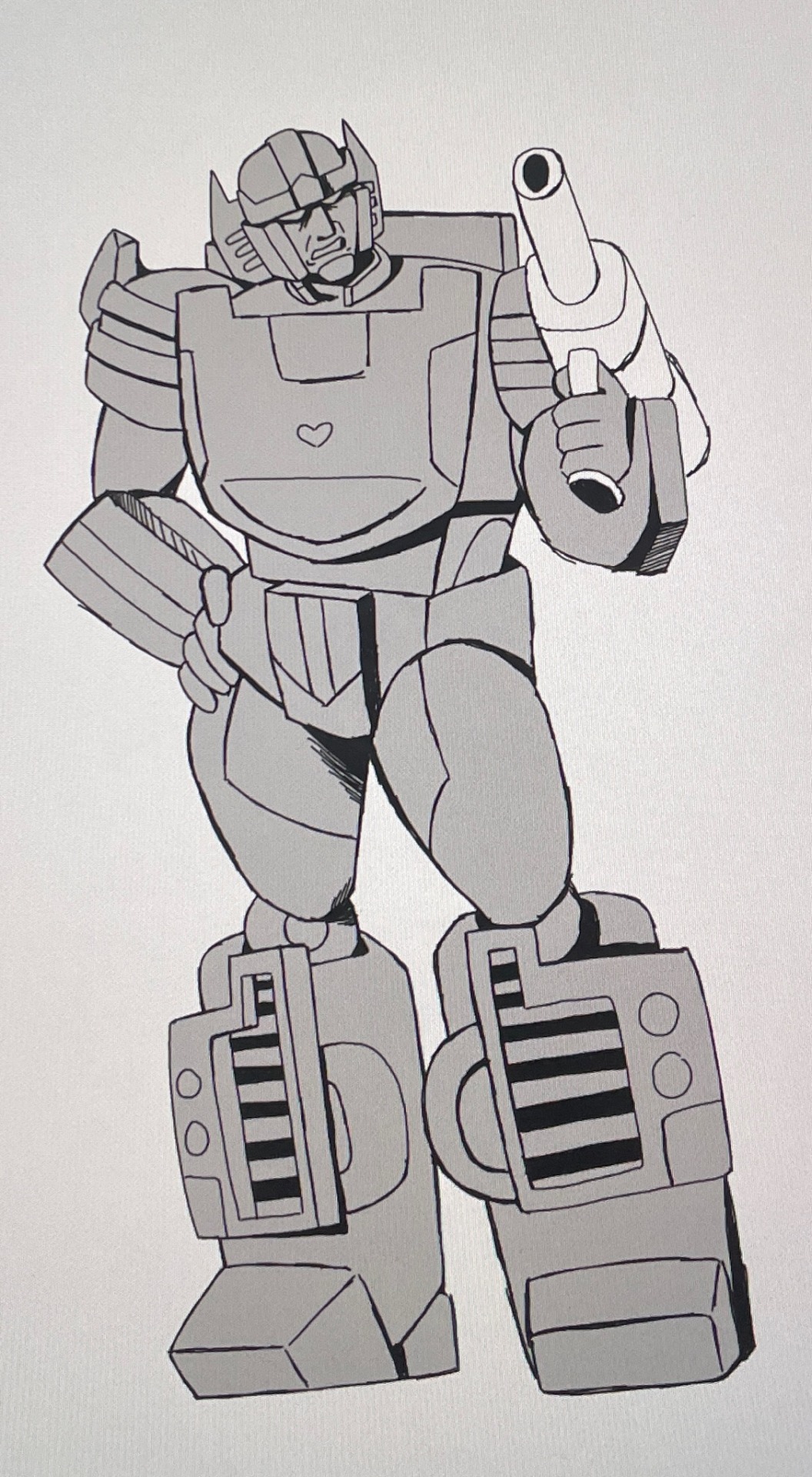
There's a lot of personalization when it comes to drawing and I don't know if I explained all of this very well. Ironically I don't really think much about how I'm doing it, I just... do it.
If you need any further explaining, I'll try my best to help. And if you made it this far ive got mad respect for you. I’m pretty sure I’m just rambling for half of this lol.
Have fun creating!!!!
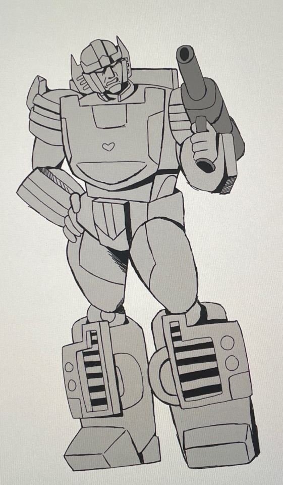
#art#doodles#transformers#fanart#transformer art#my art#sunstreaker#art process#i’m trying my best#I don’t really know how to explain#but I thought it would be fun to share#the example Sunstreaker is far from perfect tho#literally no one asked#but I woke up today and decided I was gonna do this#unpopular opinion#very sorry for that rant#am I the only one that hates it tho?#probably#anyway#I hope you enjoyed whatever this is#fr I would love to see any people that did use this to help them draw#no pressure tho
25 notes
·
View notes
Note
my heart aches for one Theodore Nott after reading the latest update 😭 GTC, could you tell us more about your thoughts on him, his characterizations, how you manage to write him so poetically and beautifully, and (a shot in the dark, but i'll bite) the role he'll play in books 5, 6 and 7? congrats on another chapter GTC, i love you tons 🩷
Thank you so much, friend. I love talking about Theodore Nott. I'll gladly bite on that question.
To start off, Theodore's middle name might as well be "THE FOIL," because everything about him is tailor-made specifically to Say Things About Draco Malfoy. He practically hands Draco a card saying "I AM YOUR JUNGIAN SHADOW SELF, PLEASE HANDLE WITH CARE" upon introduction. They meet when they're both fresh off the train. (Hermione beats Theo to Draco by a matter of hours; there's a ton of ways this story spins differently if minor details about the first chapters were changed, and that's definitely one of them.) Then Theo and Draco ride in on the boats together. (Admittedly, I was not aiming for subtlety points with this intro. They are literally "in the same boat.") Immediately, Theo is throwing out narrative parallels like he's getting paid for it: they both have a dead parent. Both parents died under weird circumstances. Their fathers were both Death Eaters. Both of them are the sole heirs and only sons of great wizarding houses. Then they go into the Great Hall together, standing in line, but — and @piedrafundamental left a really banger analysis of the Sorting Hat scene in the comments on that chapter, but I'm going to crib just one line — crucially, "M comes before N." Draco's sorted before Theodore is, and he goes into Gryffindor. Immediately after that, Theodore's shunted into Slytherin, and their paths diverge. Call this the prologue of their relationship. They're not actually gonna get to know each other until Book 2 and Book 3, but this is the part where the narrative is basically jumping up and down and waving its arms at you, going "HEY! THIS GUY! IMPORTANT TO THE STORY! GET WORRIED ABOUT WHAT HE'S DOING, OKAY?"
Then we meet him again in Book 2, and just like Draco, a year at Hogwarts has changed him. He's a little more confident, a little more cocky, a little more comfortable, and — hey, look! He's got a weirdly intense friendship with a girl around his age, too! (Surprise, surprise, Draco is with Hermione when he meets Theo again, and who makes her debut in that moment but Pansy Parkinson?) And there's Daphne, the third leg of the Slytherin Trio, the kind of girl Draco probably would end up with in Slytherin — pretty, sociable, cunning, knows his family history (literally cites it to him in their first introduction, like c'mon), is the sister of his canonical wife, etc. etc., we got layers to this shit like lasagna but this post ain't about Daphne so we gotta move on — point being, either way he flips, Draco's going to be the fourth of a quartet. Which is the entree into the Slytherin politics storyline of Book 2, a.k.a. "the temptation of Draco Malfoy," where Theo is — I mean, to be honest, for once he's really not doing anything that sinister; from his perspective, he's kind of just putting his fucking back out trying to make a friend? He's drawing Draco in a regression towards prejudice and comfort, naturally, but that's not how he sees it. But there's a counterpoint between what Theo's offering and what waits for him in Gryffindor.
So that's the starting block of his character. The rest of the work is building a real person out of that; obviously, you can't just go "this is Foil Man, does whatever a Foil Can" and expect people to be interested. Part of what makes Theo interesting, to me, is that the traits he shares with Draco include a lot of what we tend to like about him — he's driven, intelligent, cunning, and brutal in the defense of those he loves — it's just that the people he loves, the people he surrounds himself with, are deeply prejudiced people committed to doing profoundly bad things. He's been trained from birth in the art of making bad people happy, and he's gotten good at it. And he's just enough of a coward (again, pot and kettle) that he can't imagine a world where that's not the case.
And it drives him fucking crazy that Draco won't admit that. Because I think Theo thinks if he can get Draco to admit they're similar people, it'll validate the choices he's made — like, yeah, he's fucked up horribly, but anyone would do the same, if they had to face what he has. Even Saint Draco. And of course, Draco is absolutely unwilling to go there with him, because:
(a) he very much does not want to believe that his years of grueling internal growth and struggle for betterment are just the product of some good luck with a hat; i.e., a suggestion that is not just insulting but terrifying because it suggests how very close he could be to regression at any time; but also:
(b) it is a fundamental tenet of Theo and Draco's dynamic that Draco does not like Theo as much as Theo likes him. Because where Theo sees his mirror in the light, Draco sees his mirror in the dark. And it's an increasingly ugly picture.
67 notes
·
View notes
Text
Here's a little sneak peak on what to expect on the page talking about the Tu'la region!
(Aka, basically most of the information out of what's likely going to be 2-paged section since there's not a lotta info on Tu'la lol)
Totally not sharing this because I made art I'm proud off .>. (Edit: I just realized there's some information I forgot to put into this, so the final version will have a few more words :p It's just the characteristics on cursed Meif'was - aka people who were cursed into being Meif'was)

I've said it before (somewhere), and I'll say it again. I want this pdf to be as beginner friendly as possible, whether it be for both new players and new DMs.
I won't be adding detailed stuff from specific sources, or be blatantly taking things from copyrighted material and directly placing them in here (I think the closest thing that might be iffy is stuff I've taken from Daggerheart that's intended to help players and DMs create custom societies/communities, but hopefully it's okay since I'm only taking the name and basic descriptions they give rather than the entire card). - This feature can also be applied to existing regions to flesh them out if you want to take things into your own hands and explore regions that have not been explored yet in MCD/DR.
Now, if you read it, I'm sure some people might be a bit upset that there's no homebrewed Meif'wa race made from scratch. Here's the thing...there's a lot or races in D&D 5e (2014), and there's even a "Lineage" rage from Tasha's, which essentially allows you to make your own race.
And to be honest...not much is known about the characteristics of Meif'was outside of them looking and occasionally acting like cats? Besides that, I couldn't really find anything that could help them stand out as their own race.
So, instead of making it a whole thing... I've instead put down a suggestion that, since the players are the creators of their characters, that they should be able to use any race (within reason) to define their character's appearance and function. This will also be applied to the Lu'pine/werewolf race, in some degree.
Personally, I'm someone who tends to view races, or "species" as they're now called since the 2024 version, as a guideline. Simply put, if I want my character to look a little strange or have a unique feature from the norm, I'll take a race that suits it best and change it up.
Take Tieflings for example. Tieflings are depicted to be devil/demon-like, but in most cases, even in D&D's Forgotten Realms, demons and devils can look like a lot of things, and there's even some anthropomorphic entities that are classified as demons/devils. What's stopping you from playing a fox-like character with an infernal heritage? Or someone who looks like a basic human but with infernal traits?
There's also the Owlin race, which is depicted to being an anthropomorphic owl that can be medium or small sized. I'm someone who likes to draw human faces, so what's stopping me from playing a human-looking guy with large bird-like wings?
I want this PDF to encourage creativity and out-of-the-box thinking. I've played with many players and GMs who are way too stiff with their creativity, mainly when it comes to character creation.
Sure, a human is meant to be generic, but what's stopping you from making them be more doll-like thematically? You're not changing the way they function, but you are changing the way they appear and behave. Systematically, this way of creativity is harmless.
There are subraces of all kinds, and all of them can't be covered entirely in official content. Another reason I'm not adding homebrew races or classes into this is not just because of balancing reasons, but because some DMs might not be open to homebrew, or some players might get nervous or uncomfortable with homebrew creations (like I am).
I do plan on making a page that'll be a kind of guide on how to "mix and match" certain things, though mainly in the terms of backgrounds. Did you know that, apparently, you can change your background feature to whatever feature you want if you're not happy with it? I DIDN'T UNTIL EARLIER THIS WEEK!
I'm also adding a few examples of homebrewed rules some games tend to have, since I'm sure some (or most) members of this community are not experienced in D&D 5e on a personal level. (Examples are bonus action healing potion, secret death saves, etc. I will be throwing in a personal rule I made for my games as an option.)
Anyways, enough of me rambling. Here's a closer shot of the Meif'wa guy I made! Was gonna make three to show range, but I got tired and I ended up liking him a lot -w- No name for him though... But I might just keep it that way for fun lol

Hydrate!
#art#dnd#dungeons and dragons#aphmau#aphmau mcd#aphverse#original characters#mcddnd#minecraft diaries#meif'wa#dnd 5e homebrew
29 notes
·
View notes